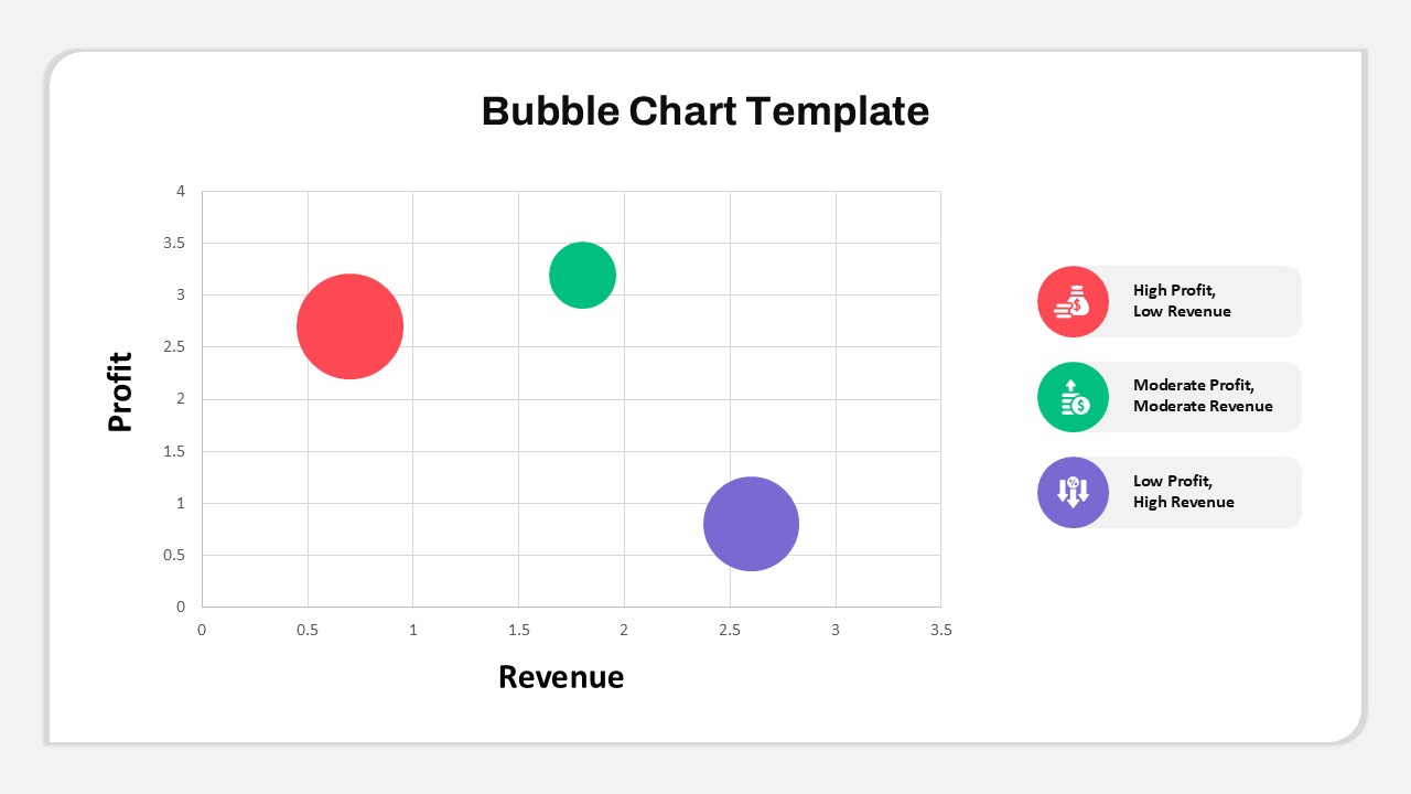
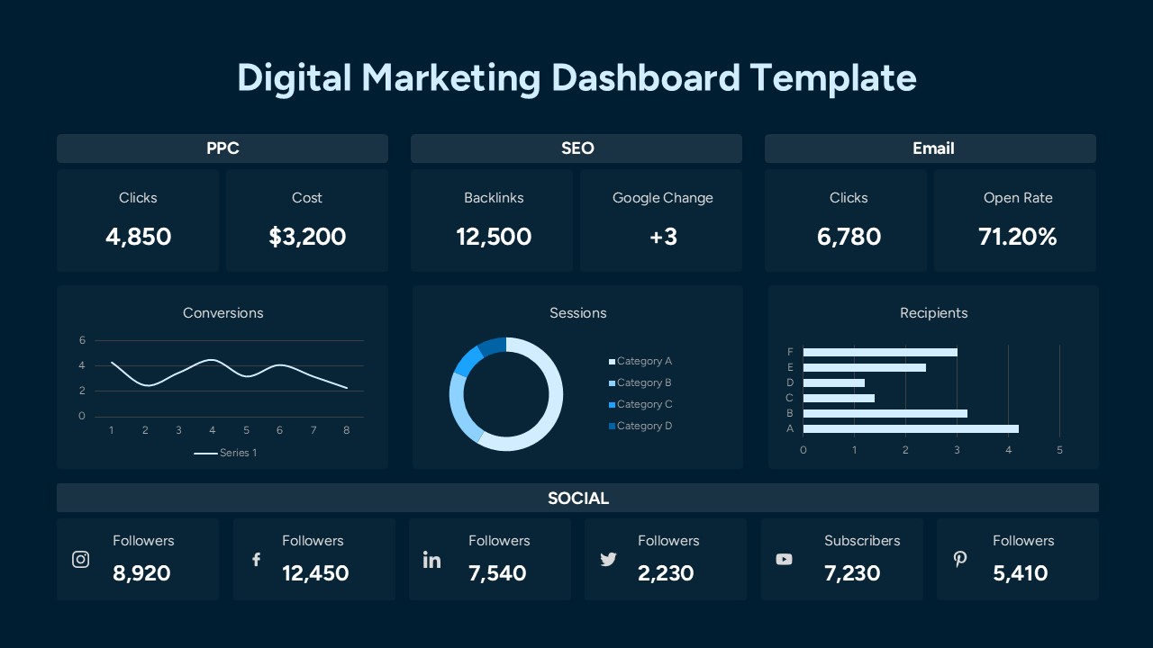
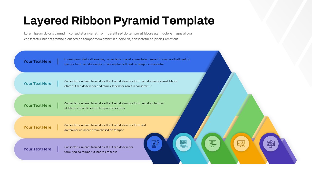
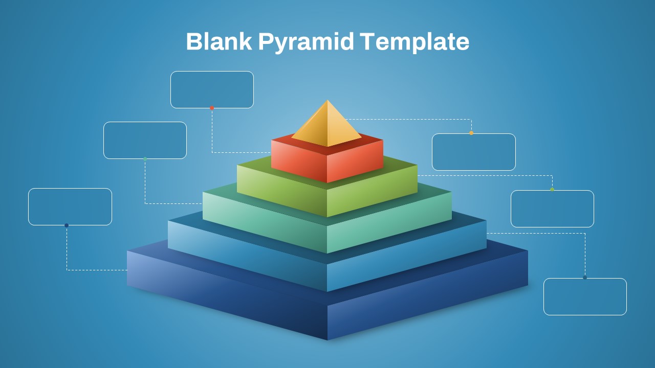
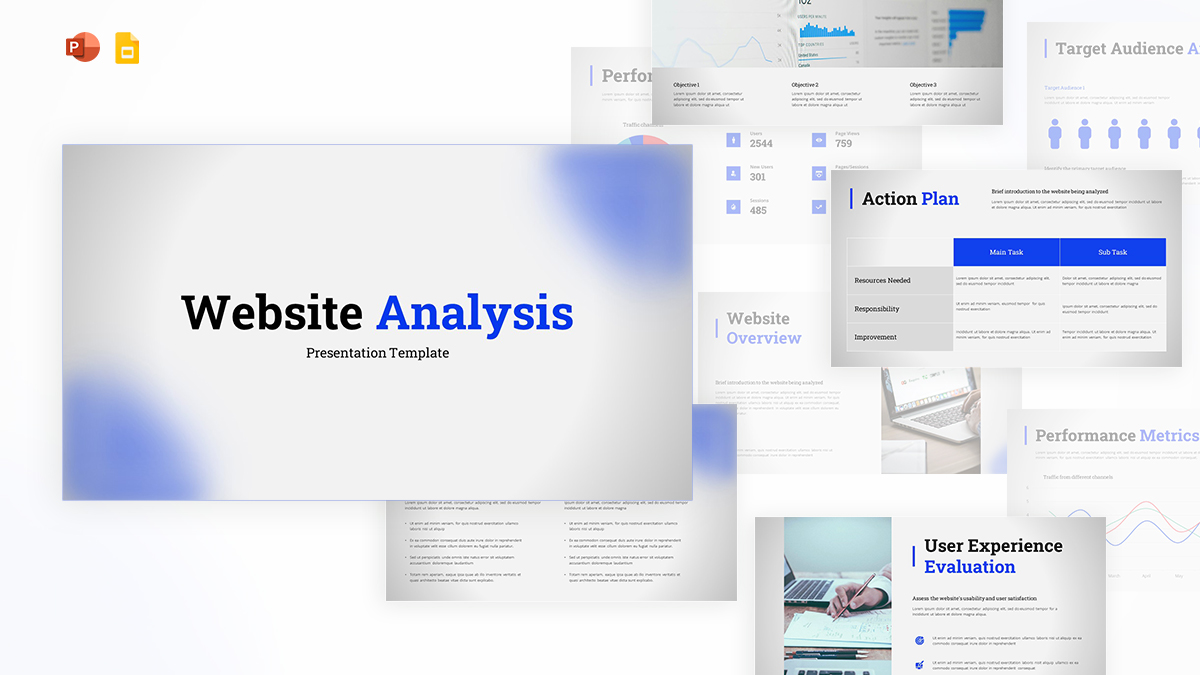
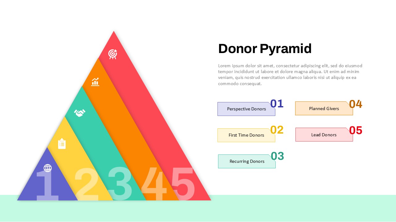
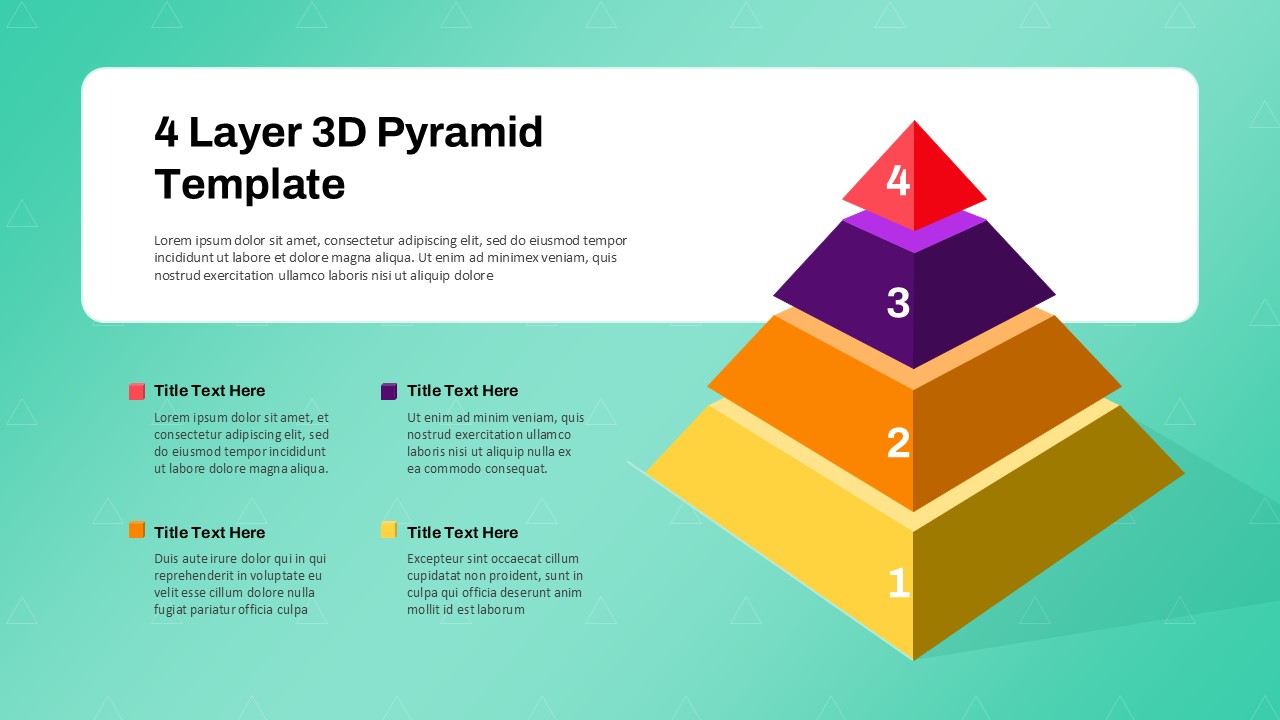
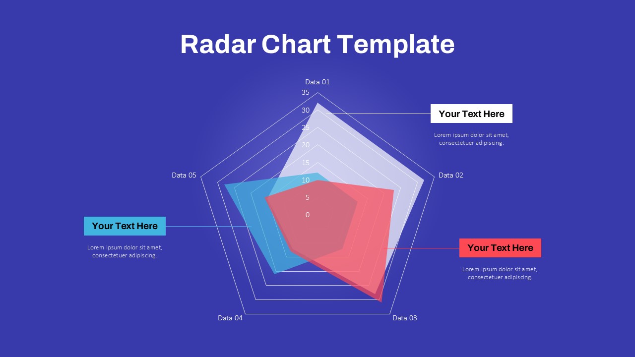
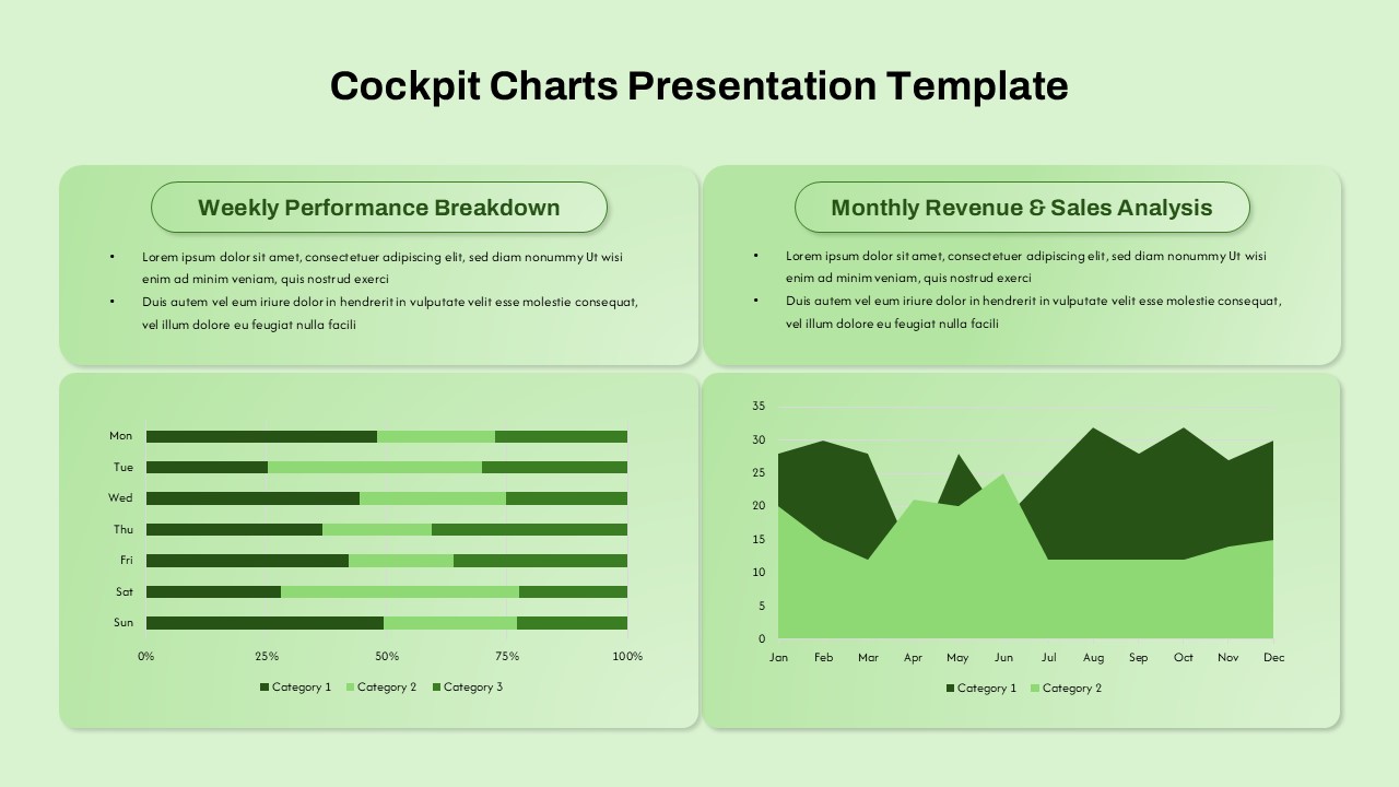
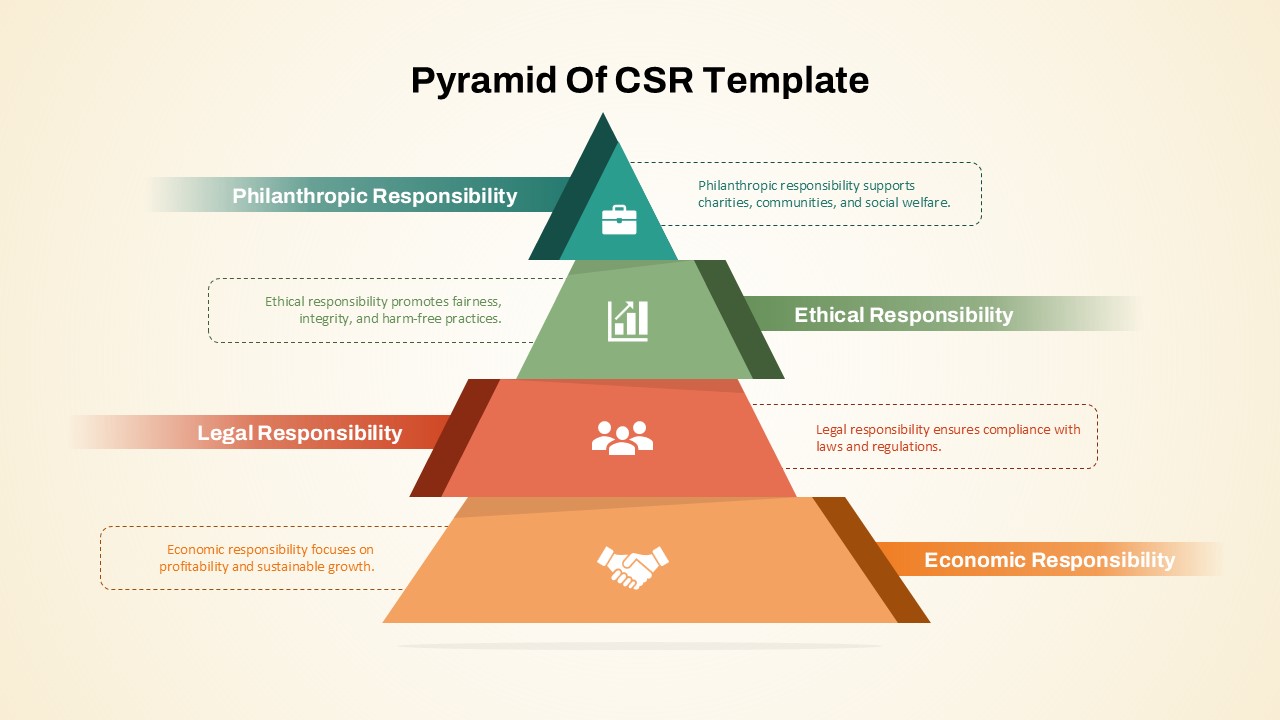
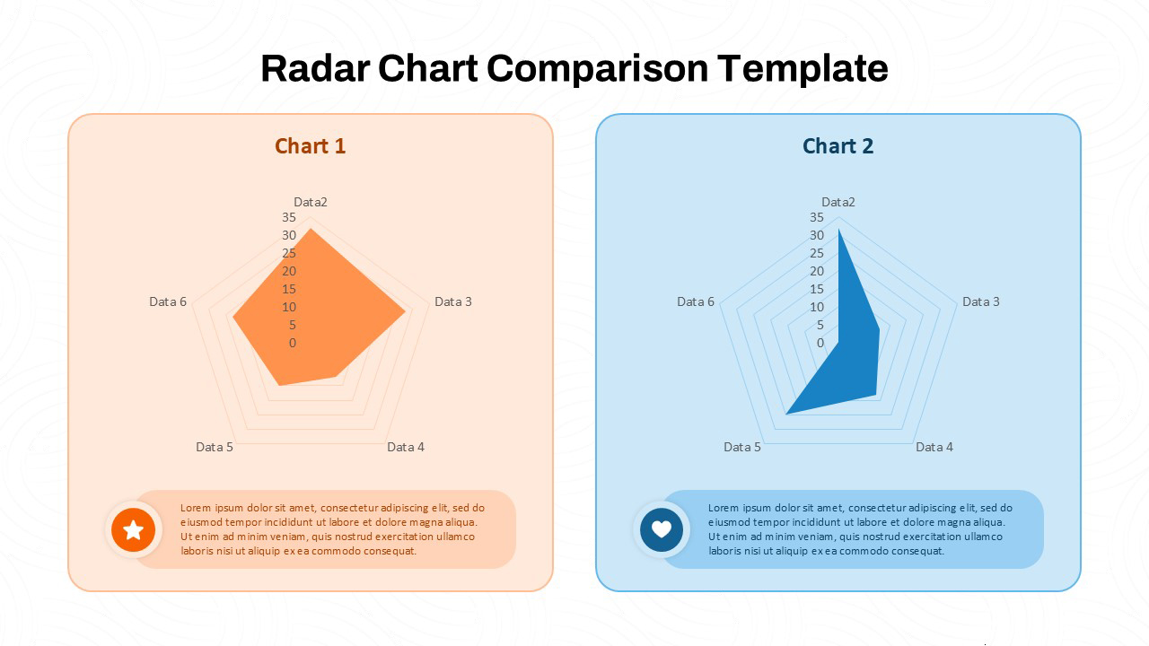
3 Axis Pyramid Data Chart PowerPoint Template
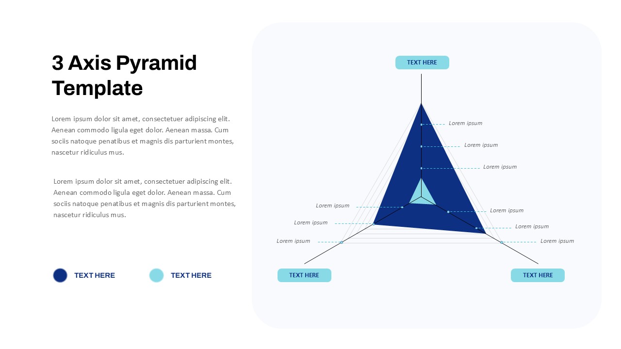
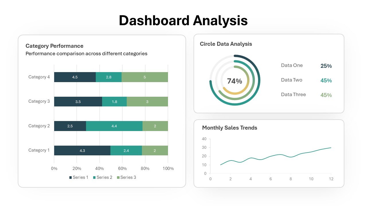
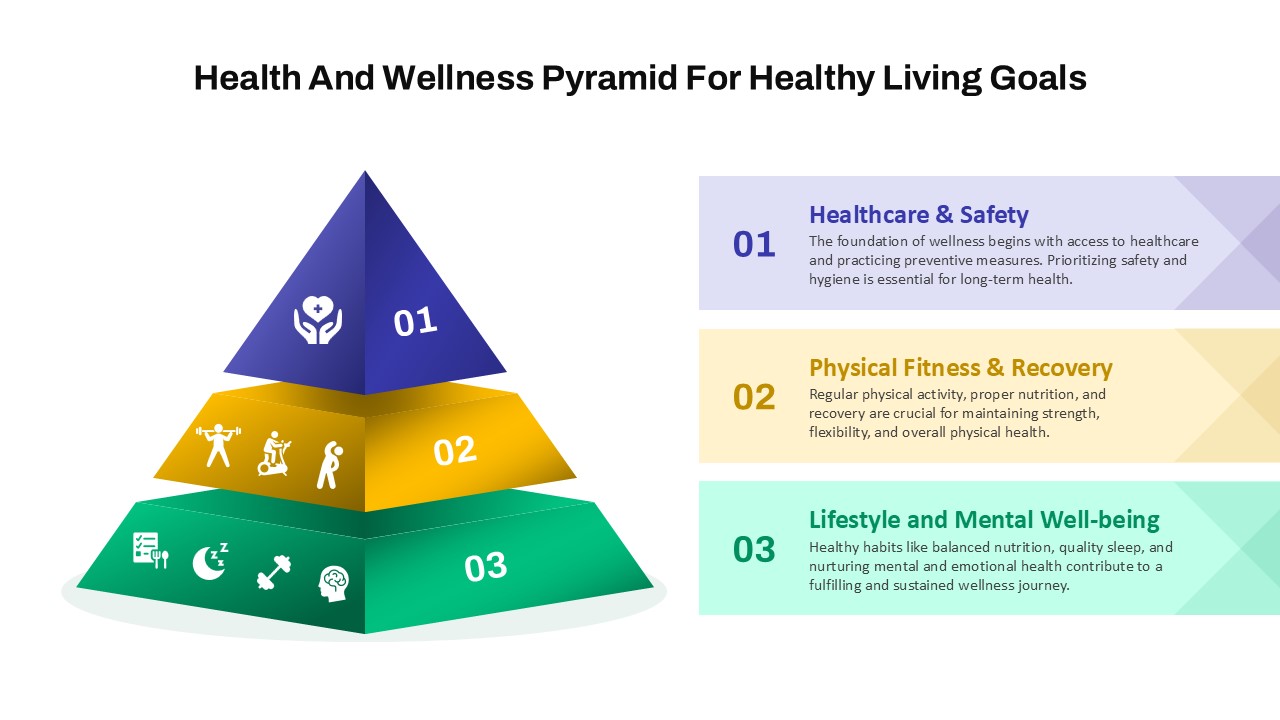
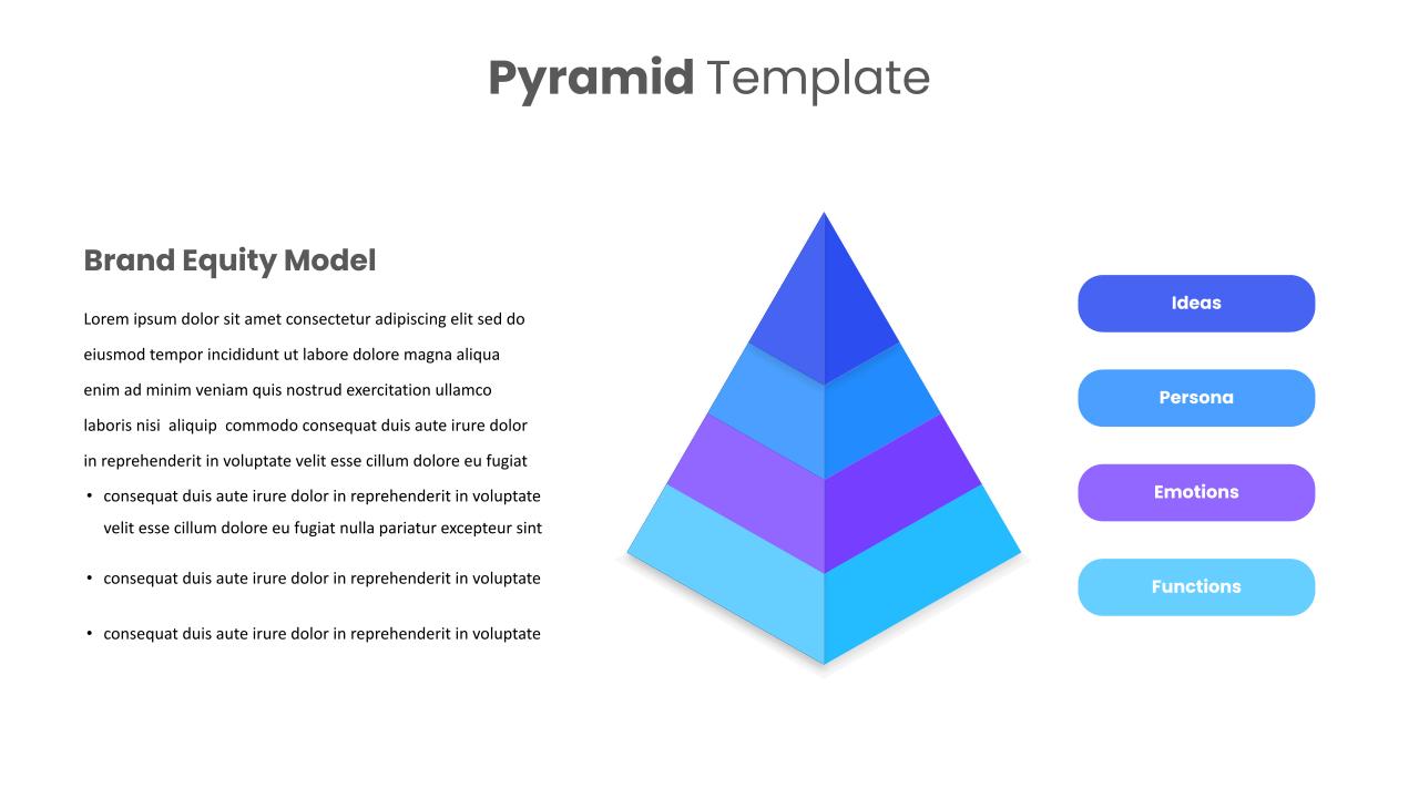
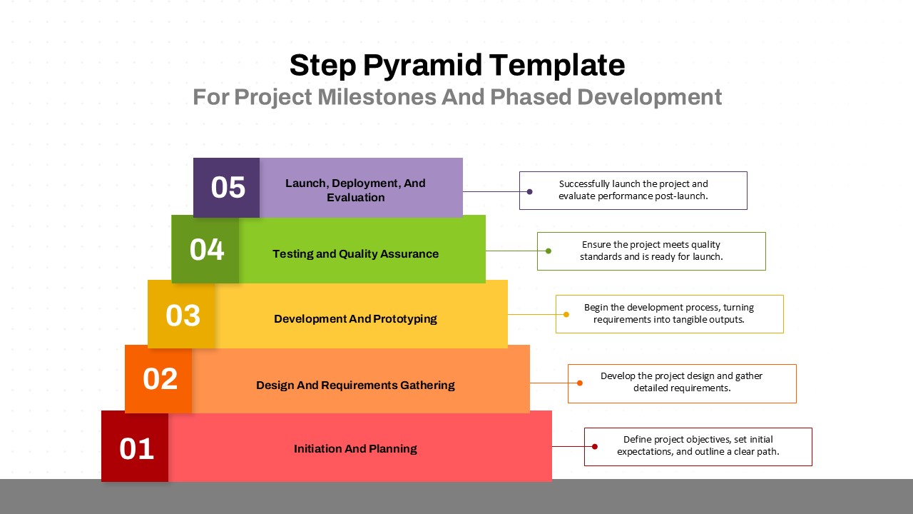
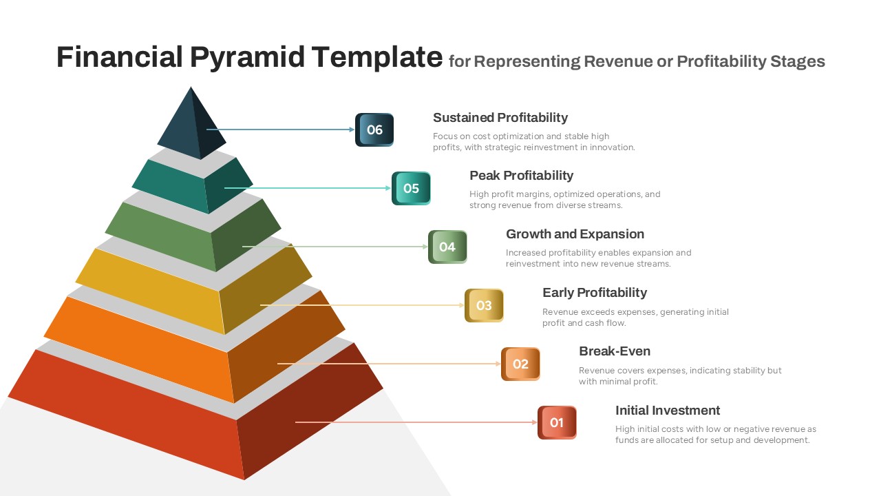
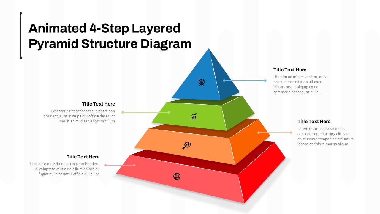
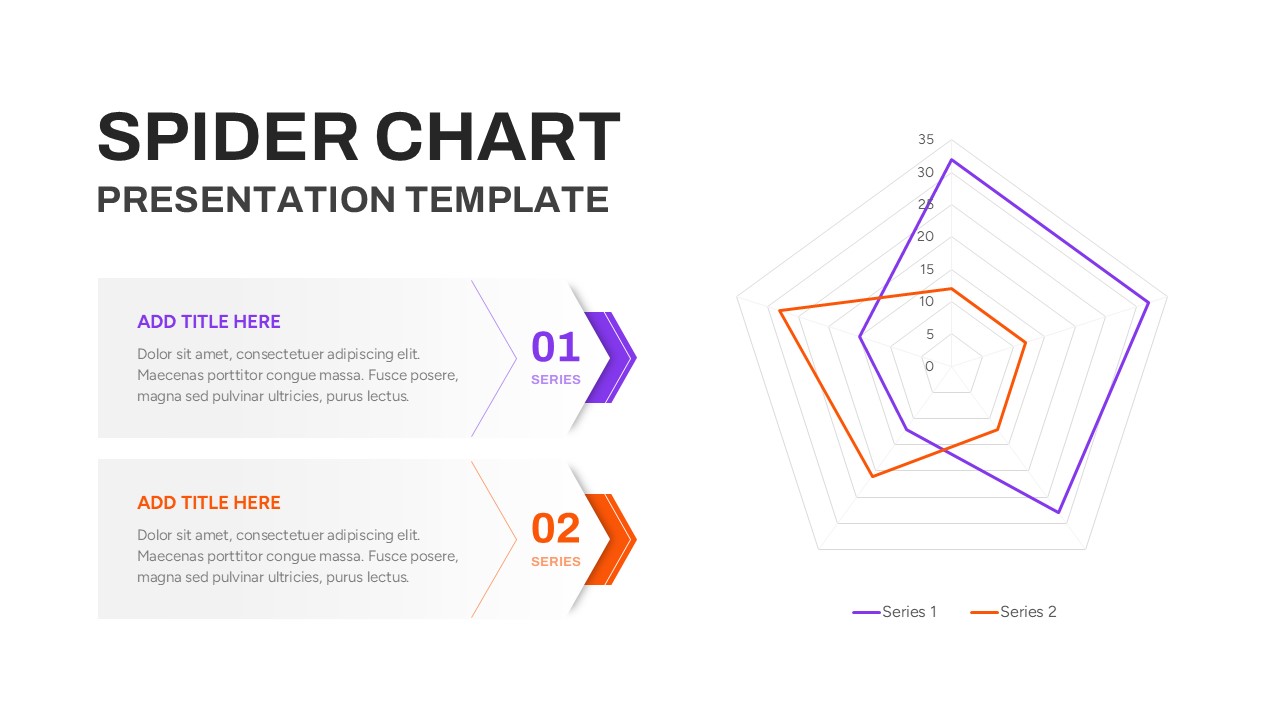
The 3 Axis Pyramid Data Visualization PowerPoint Template offers a compelling and modern approach to showcasing multi-dimensional data through a triangular radar-style diagram. Designed for professionals who seek clarity and impact in their presentations, this template is ideal for illustrating comparisons across three interrelated variables or performance metrics. With its layered and color-coded triangular design, the template simplifies complex data analysis into a visually intuitive format that enhances audience comprehension.
This pyramid ppt template’s layout features a central triangular axis system that allows you to map data across three key points, making it perfect for presentations involving market segmentation, capability assessment, or strategy evaluation. The dark-to-light gradient fills in the triangle segments effectively highlight varying data ranges or intensity, helping you draw attention to strengths, gaps, or patterns in your datasets. The design is sleek, corporate-ready, and adaptable for both internal and external communications.
Ideal for use in team meetings, business strategy sessions, or investor pitch decks, the template enables quick customization with editable text placeholders and scalable chart elements. Its clean visual hierarchy ensures your key messages are communicated with clarity and professionalism. Whether you’re comparing department performance, tracking project metrics, or analyzing stakeholder feedback, this template helps convert abstract insights into persuasive visuals.
, the 3 Axis Pyramid Template ensures seamless integration into your preferred workflow.
See more

Aspect Ratio
16:9Item ID
SKT03652
Features of this template
Other User Cases of the Template
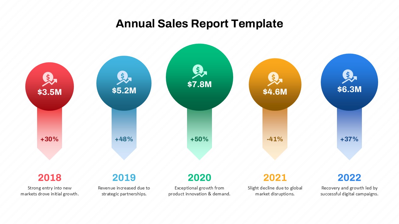
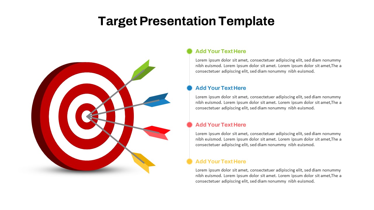
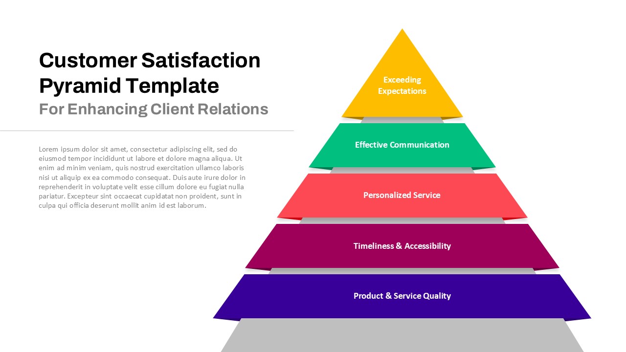
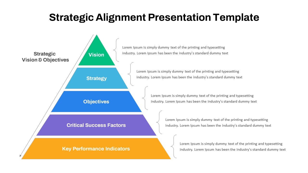
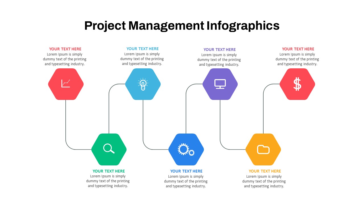
Business strategy mapping, project performance tracking, marketing channel analysis, product capability assessment, team skill evaluation, competitive benchmarking, stakeholder sentiment analysis, goal alignment presentations, data storytelling, executive summary visuals
FAQs
You May Also Like These Presentation Templates


- Free

- Free


- Free
- Free
- Free
- Free