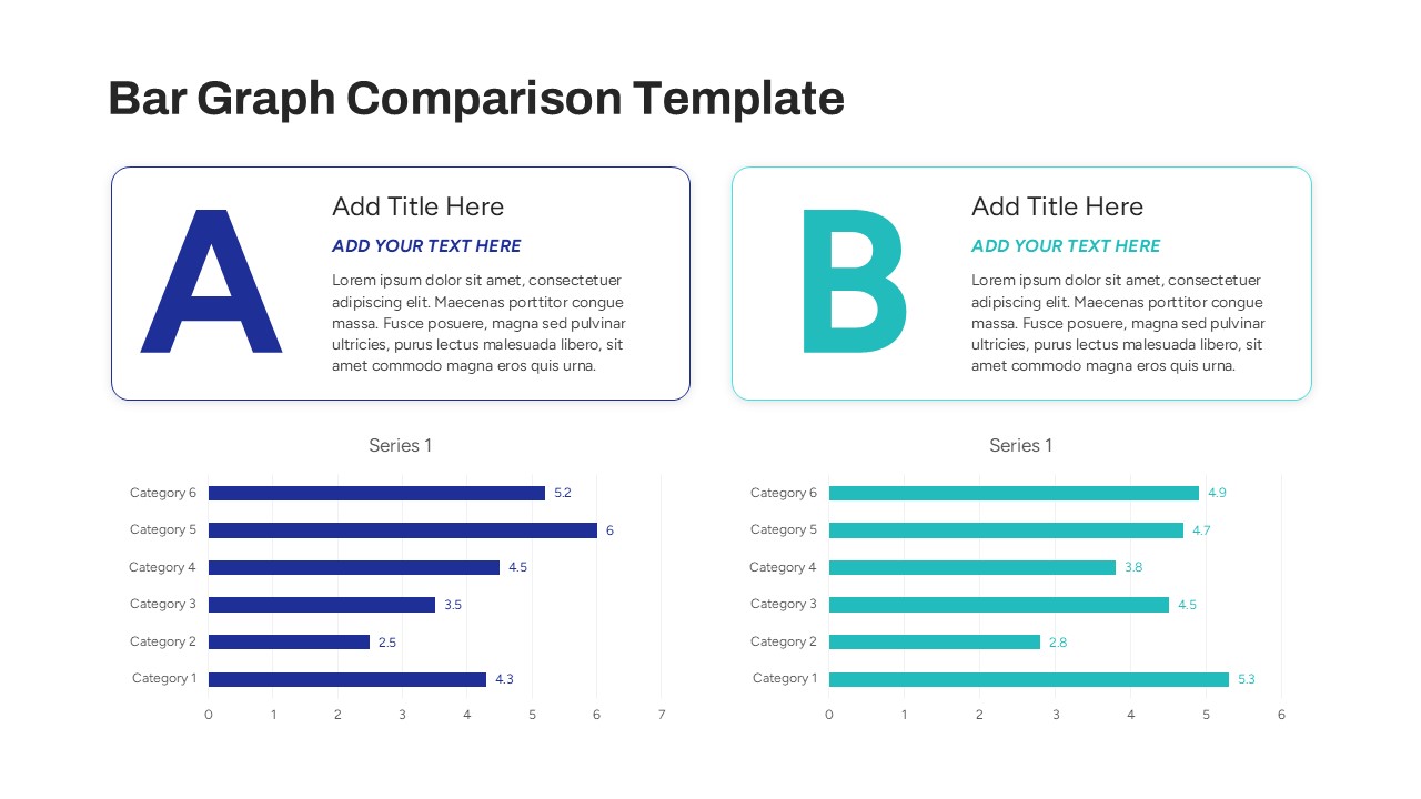
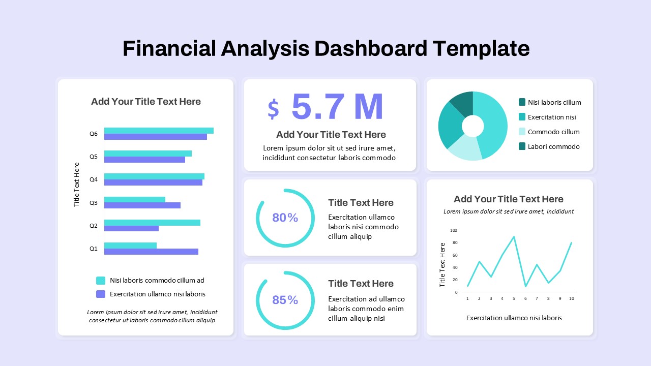
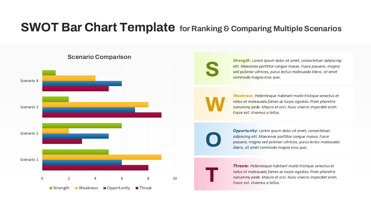
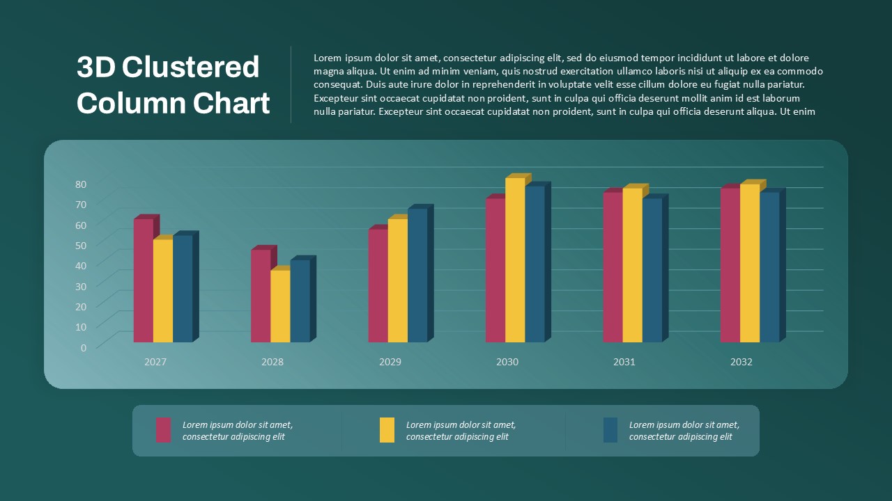
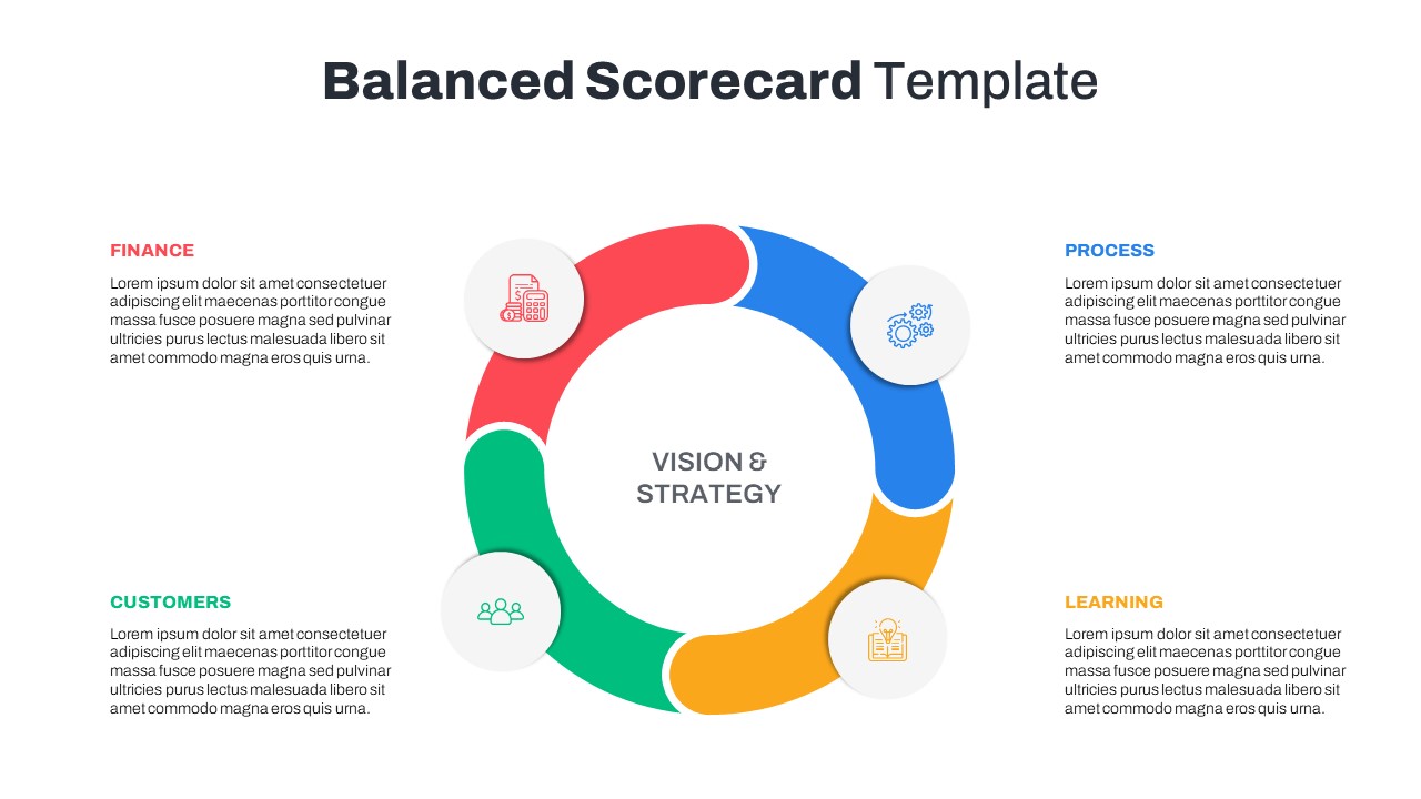
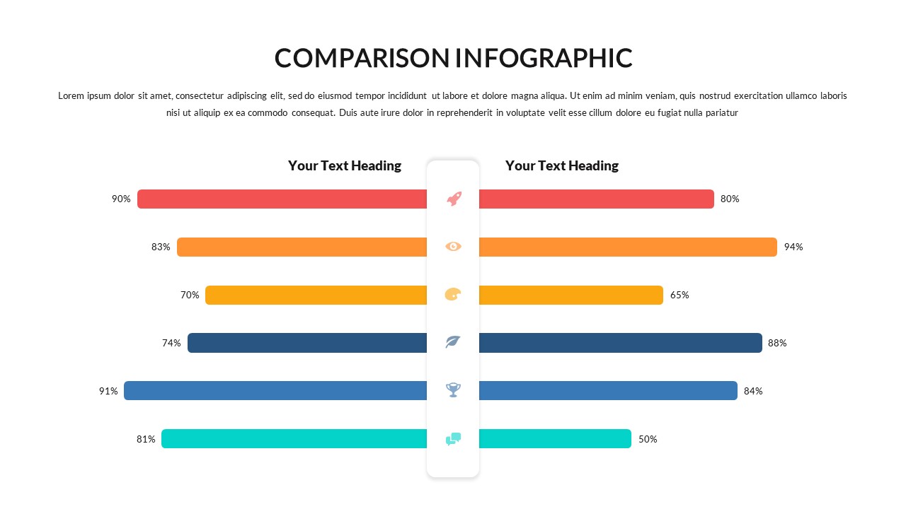
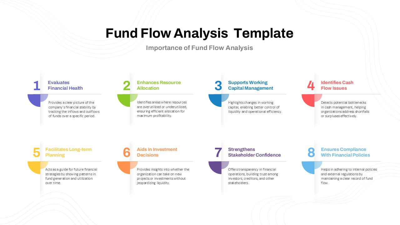
3D Data Comparison PPT Presentation Template

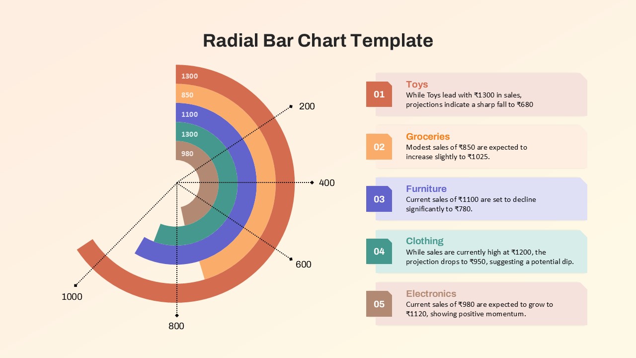
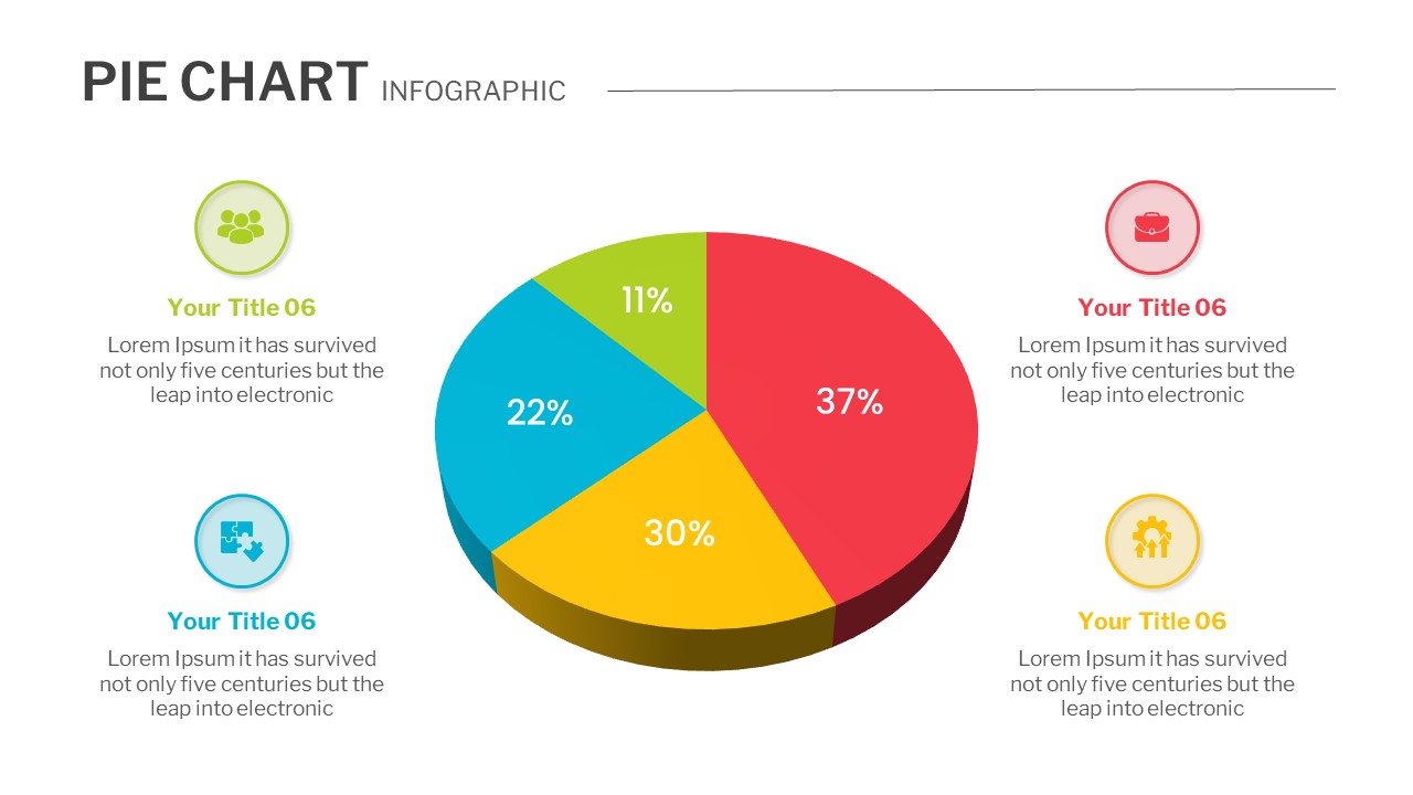
Visualize data insights with clarity using the 3D Data Bar Chart Comparison PPT Presentation Template. This modern and professional template is designed for business analysts, marketers, financial planners, and educators who need to compare data sets side by side in a visually compelling format.
Key Features:
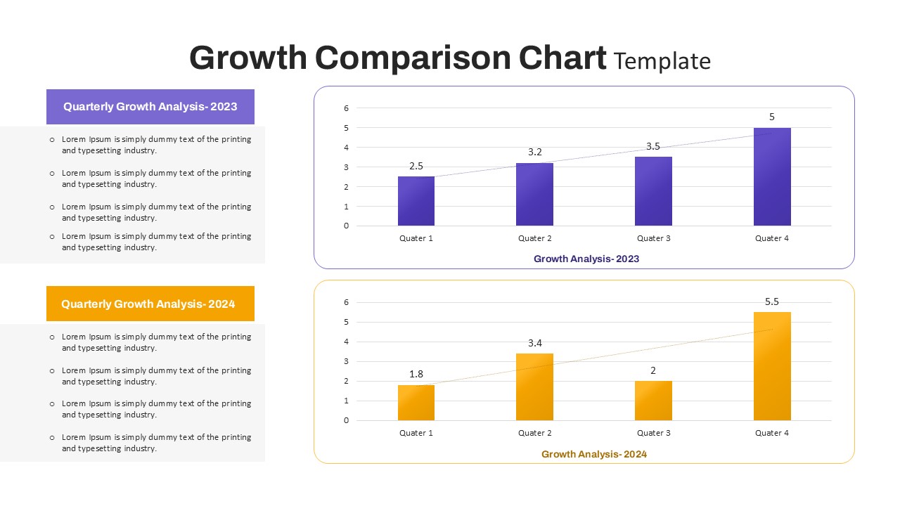
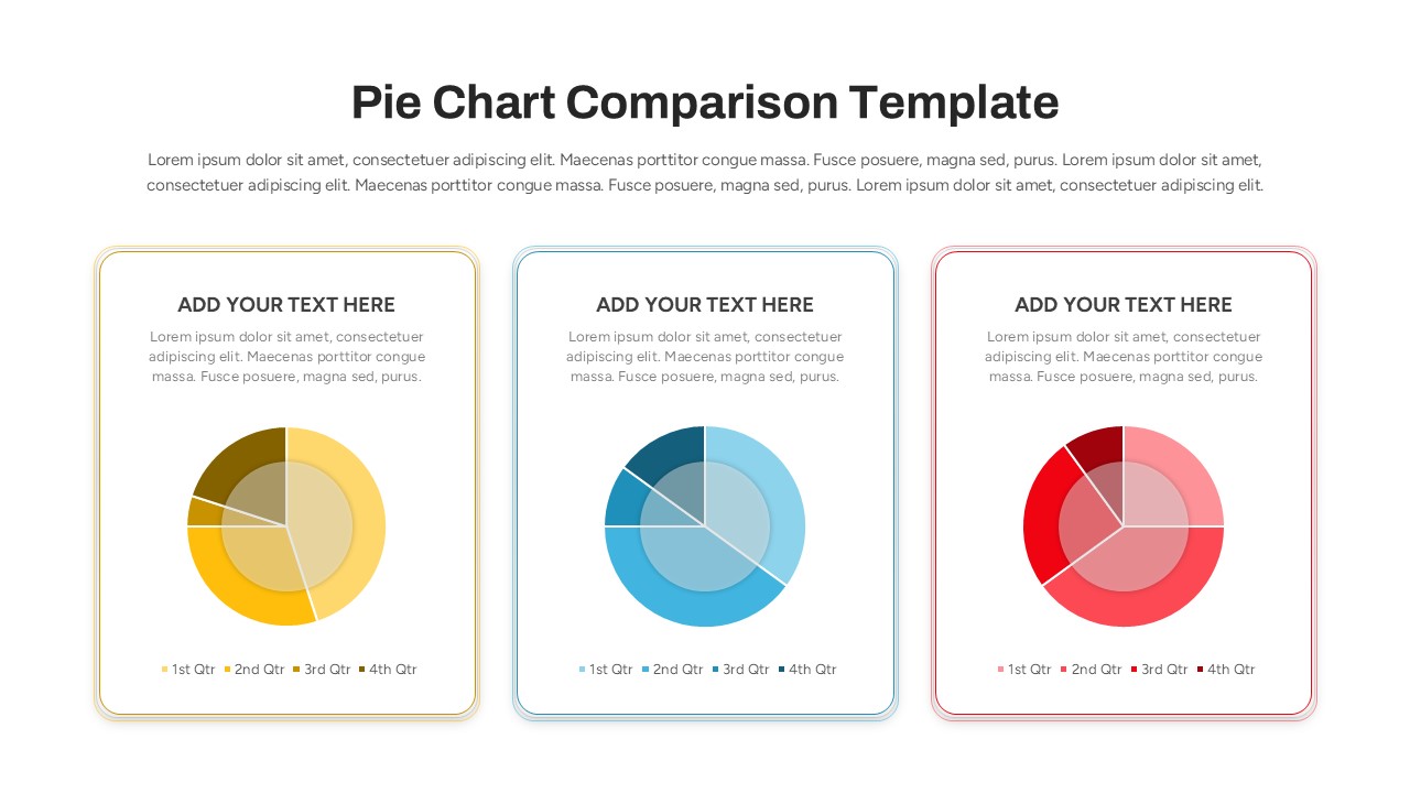
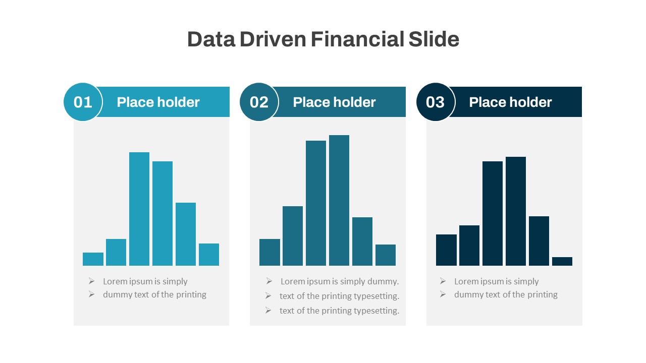
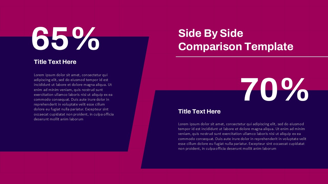
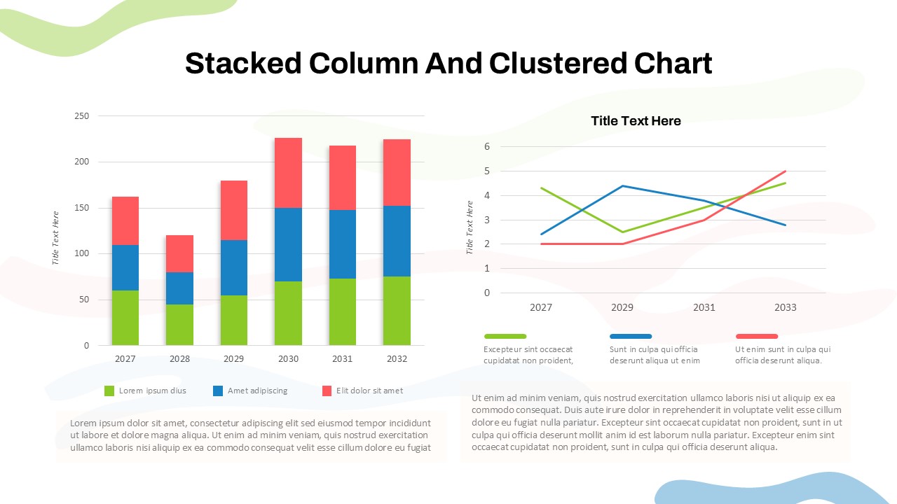
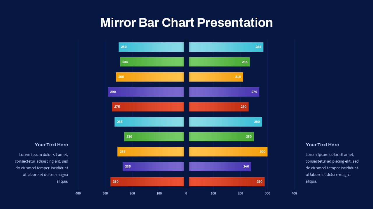
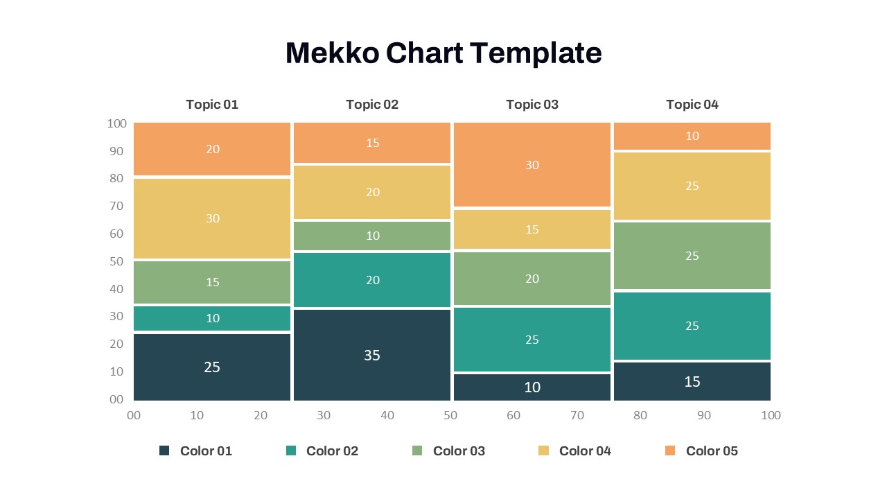
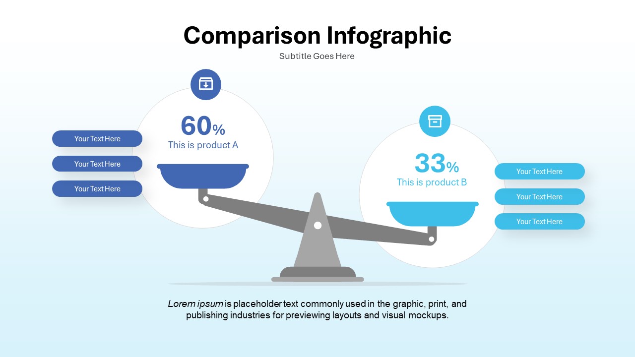
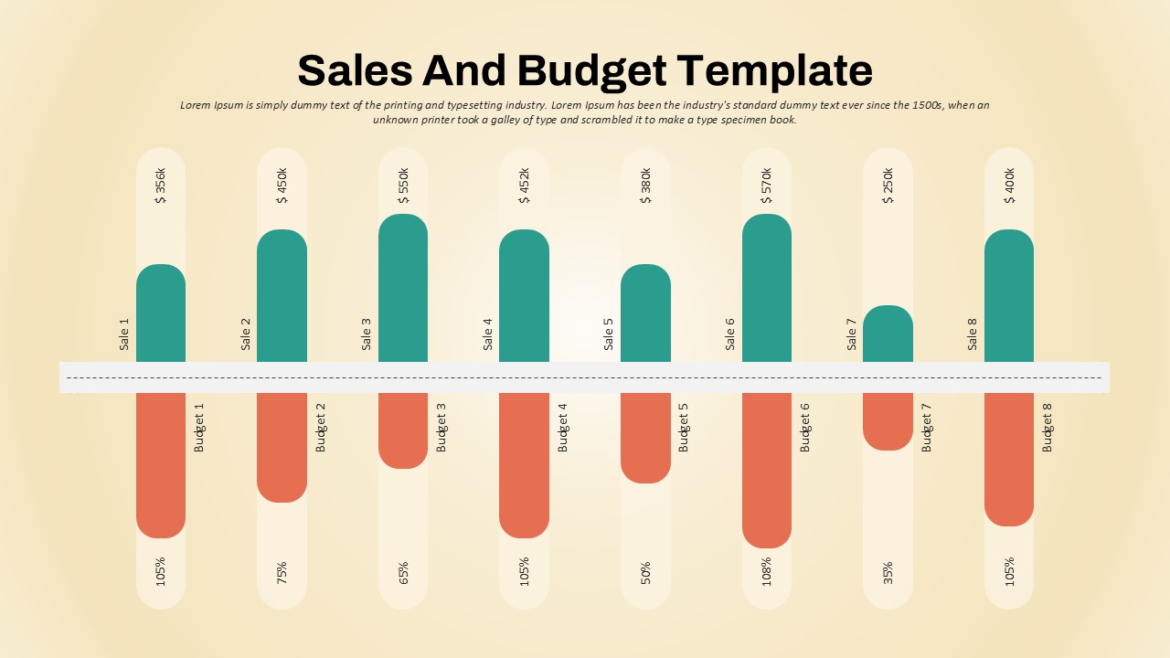
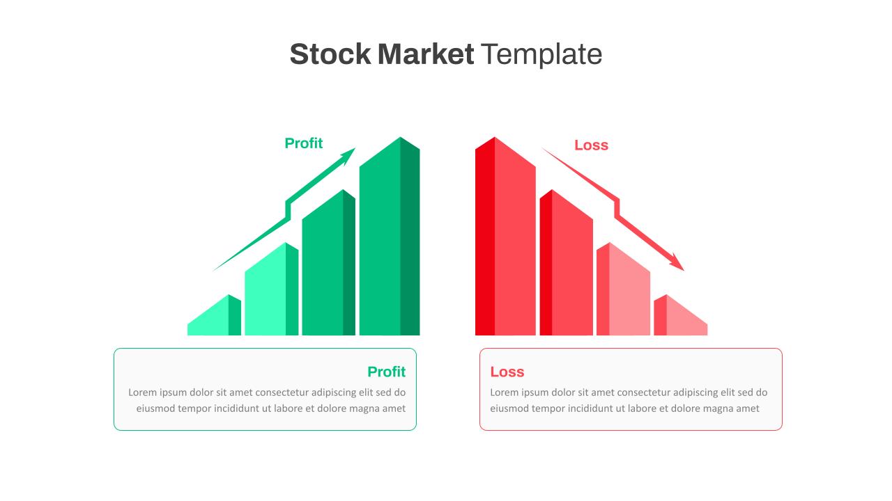
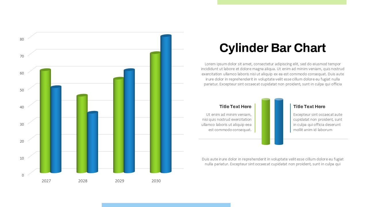
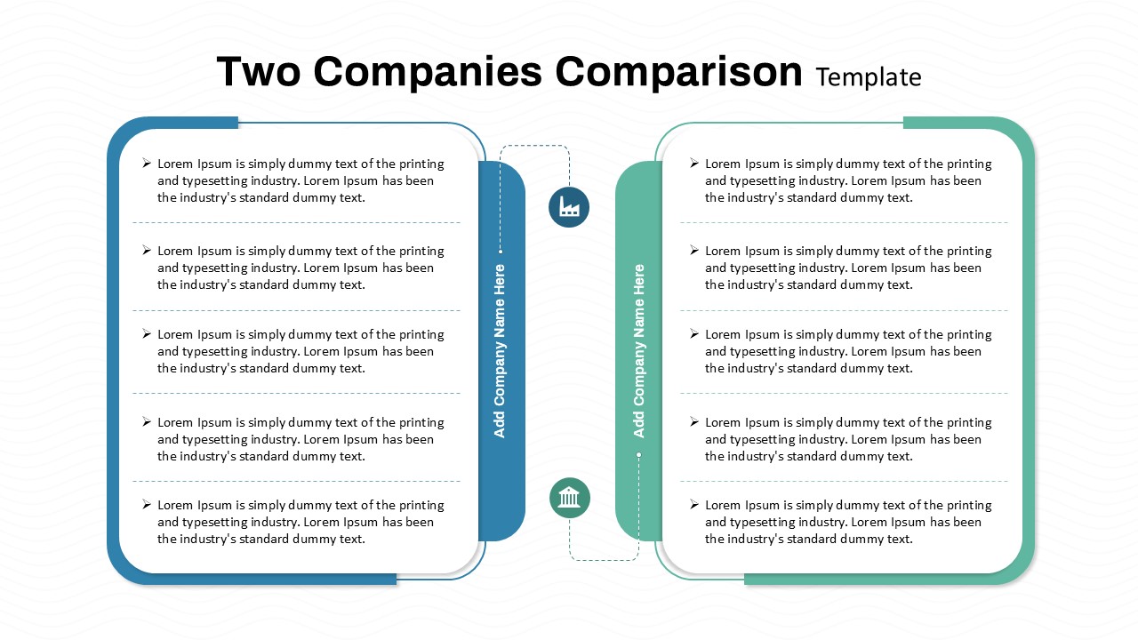
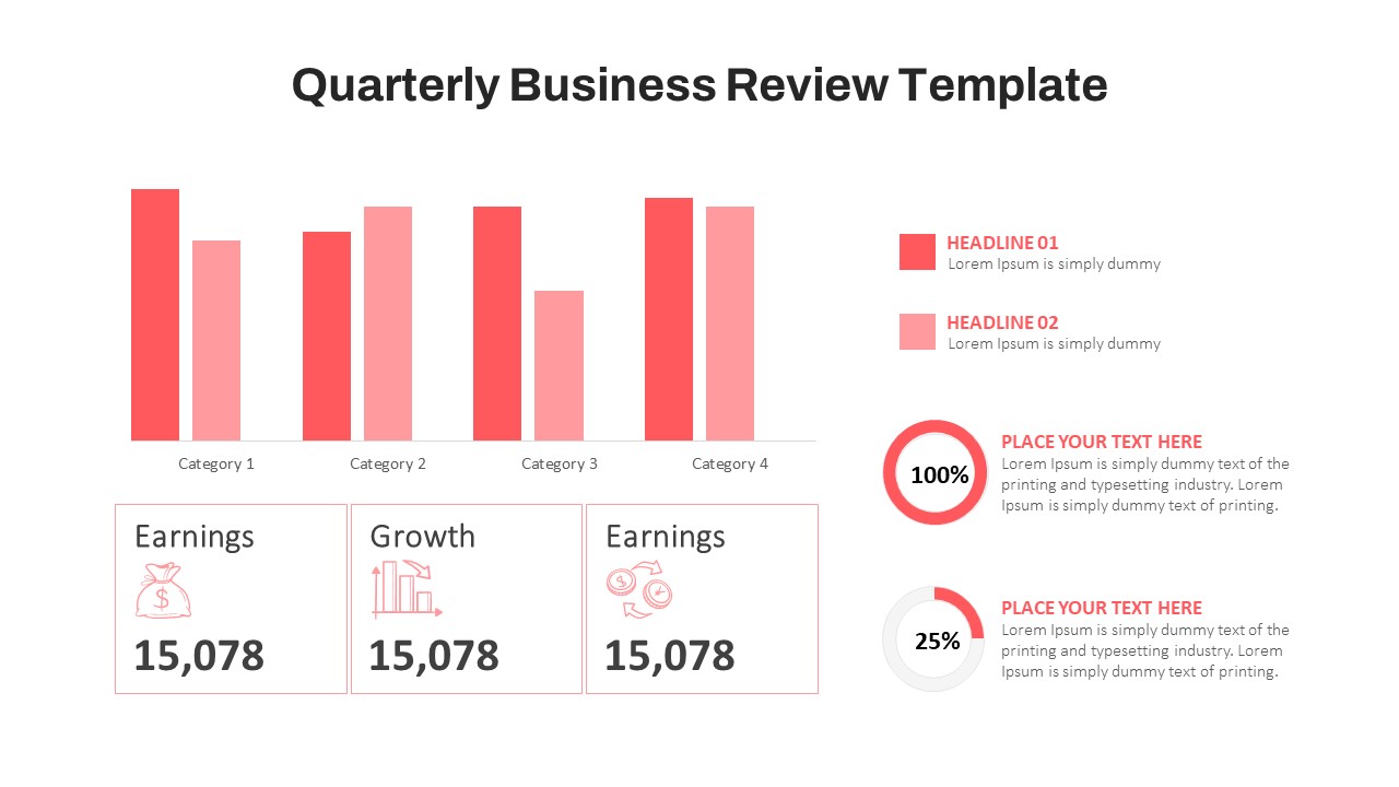
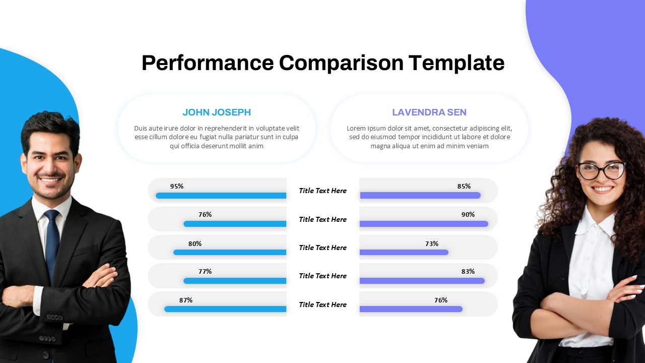
- 3D Bar Chart Comparison – Two distinct datasets (Data 01 & Data 02) displayed with a side-by-side visual format for easy comparison.
- Color-Coded Data Representation – Green and red contrasting colors to differentiate between datasets, enhancing readability.
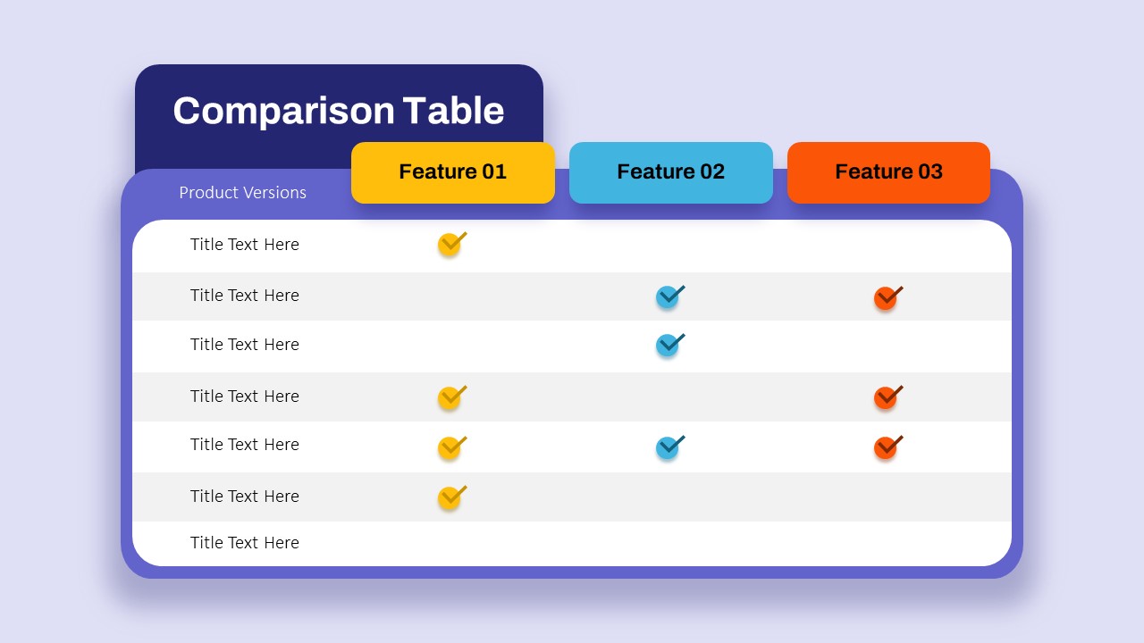
- Structured Layout – Two-column design with sections for data descriptions, making it ideal for performance reviews, financial reports, and marketing analytics.
- Fully Customizable – Edit text, colors, labels, and chart data to match your needs.
- Modern, Clean Design – Ensures a professional look suitable for corporate reports, sales presentations, and research findings.
This template is perfect for business strategy meetings, KPI reviews, progress tracking, financial comparisons, and competitive analysis. Whether you’re analyzing trends, comparing results, or making data-driven decisions, this engaging and easy-to-use template helps you communicate key insights effectively.
See more

Aspect Ratio
16:9Item ID
SKT03347
Features of this template
Other Use Cases of the Template
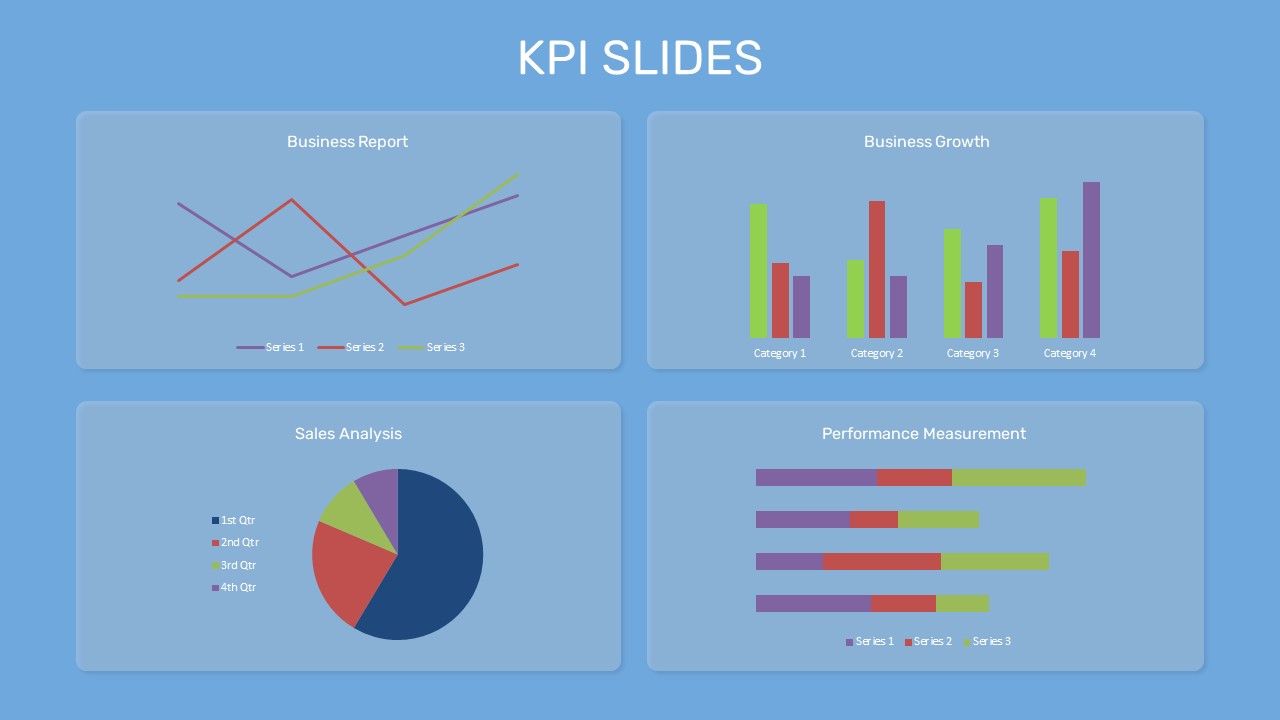
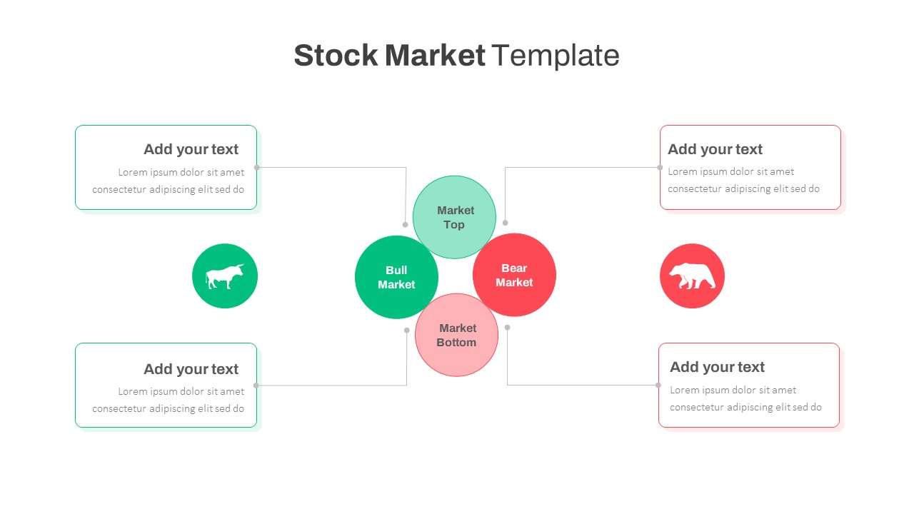
Business performance analysis, financial data comparison, market research reports, sales growth tracking, marketing campaign analysis, competitor benchmarking, quarterly business reviews, customer demographics comparison, KPI reporting, product performance analysis.
FAQs
You May Also Like These Presentation Templates


- Free

- Free

- Free
- Free
- Free
- Free
- Free
- Free
- Free