Bubble Chart PowerPoint Template and Google Slides

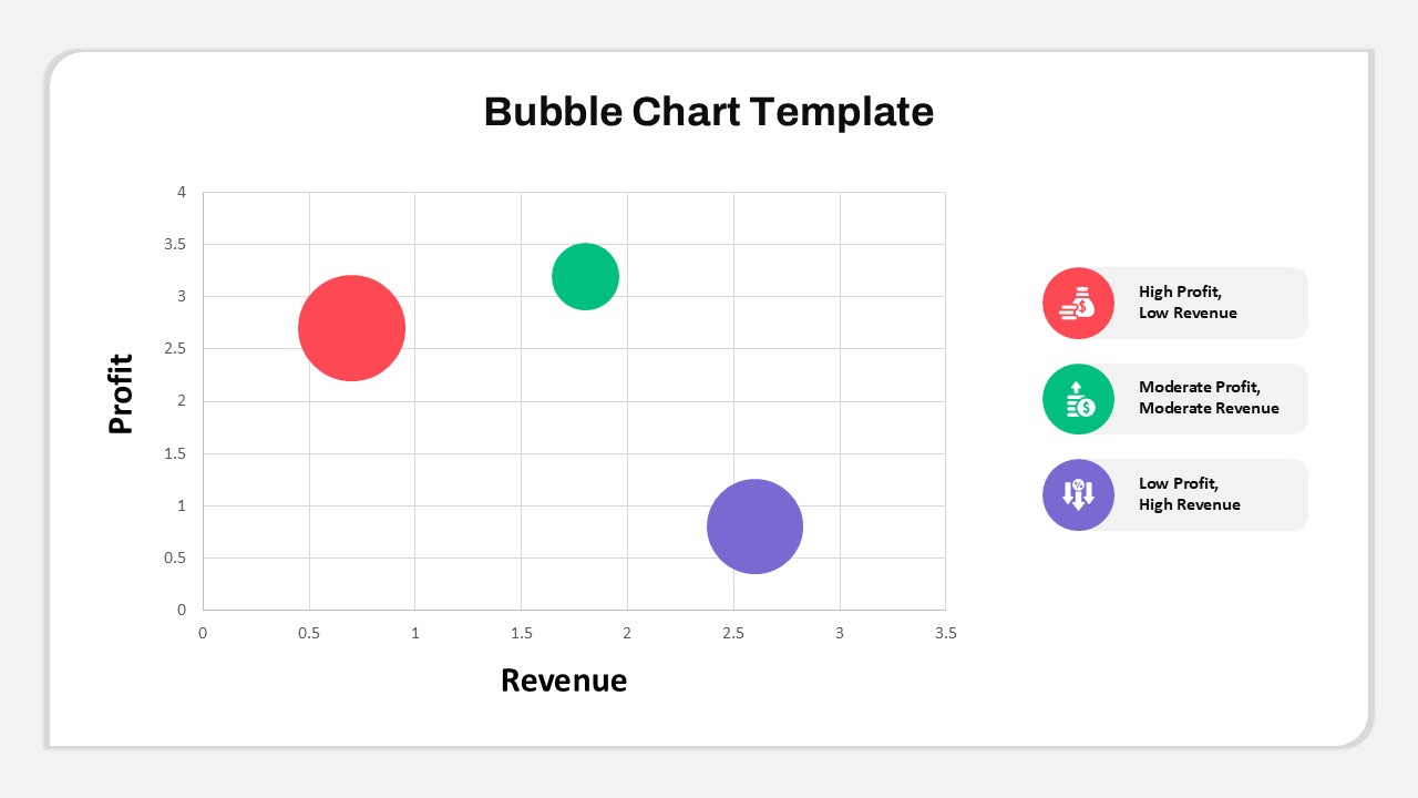
Visualize complex data with clarity using this Bubble Chart PowerPoint Template and Google Slides. This template is perfect for comparing multiple variables, making it especially useful for analyzing relationships between profit, revenue, and other performance metrics. The chart consists of color-coded bubbles of varying sizes that represent different data points—each bubble’s position along the x-axis and y-axis indicates revenue and profit levels, respectively, while the size of each bubble can signify additional variables, like market share or investment size.
Incorporating a simple, modern design, this template includes a legend for quick reference, with color-coded indicators for high profit and low revenue, moderate profit and revenue, and low profit but high revenue. This setup allows audiences to quickly grasp the relative performance of different entities or departments at a glance. Customizable text and colors mean you can adjust the data presentation to match your corporate branding or presentation theme.
Ideal for finance professionals, business analysts, and project managers, this Bubble Chart Template is a powerful tool for comparing performance metrics, identifying trends, and supporting strategic decision-making. Use it to convey insights in investor presentations, monthly business reviews, and market analysis discussions. Its straightforward layout ensures that even complex data sets are easy to interpret, enhancing your ability to communicate critical findings effectively.
See more


