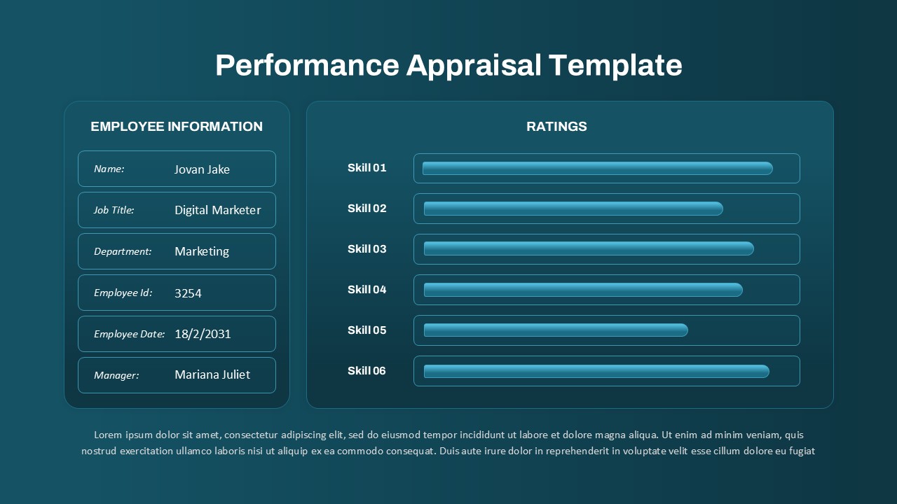
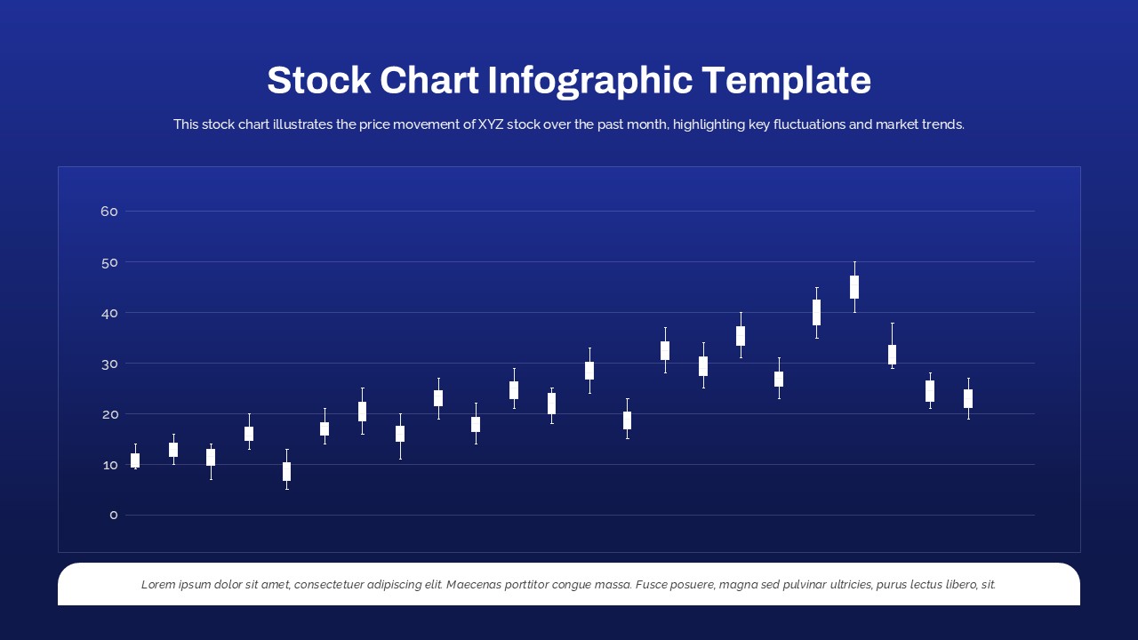
Cockpit Dashboard Charts PowerPoint Template
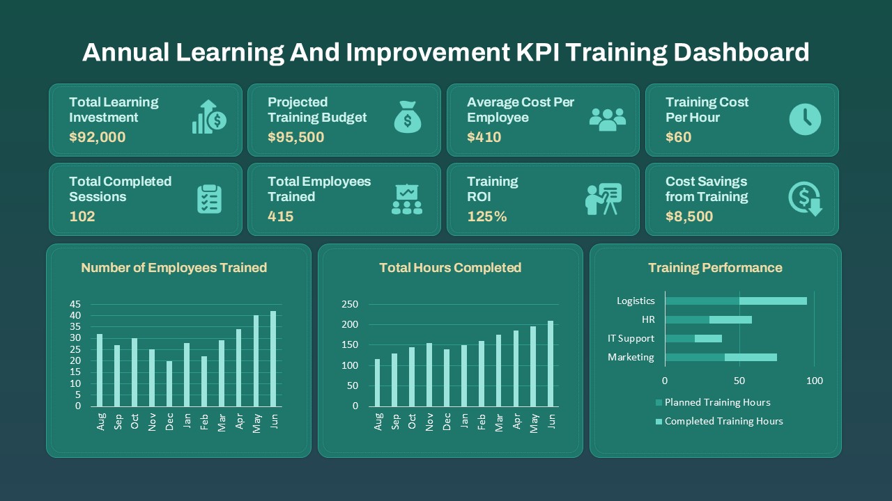
The cockpit dashboard charts PowerPoint presentation template is a highly functional and visually cohesive tool designed to simplify data visualization for performance tracking and business analysis. With a modern and structured layout, this template allows users to consolidate multiple key performance indicators (KPIs) into a single, easy-to-understand view—ideal for executive briefings, project updates, or strategic meetings.
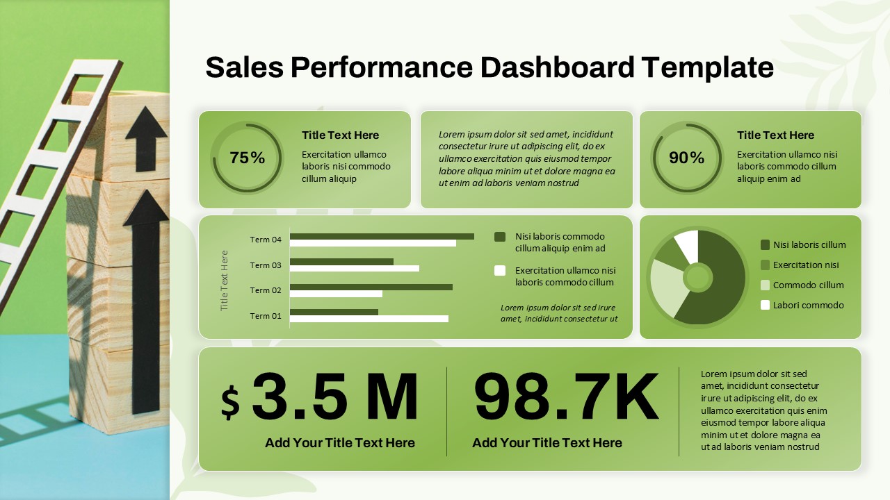
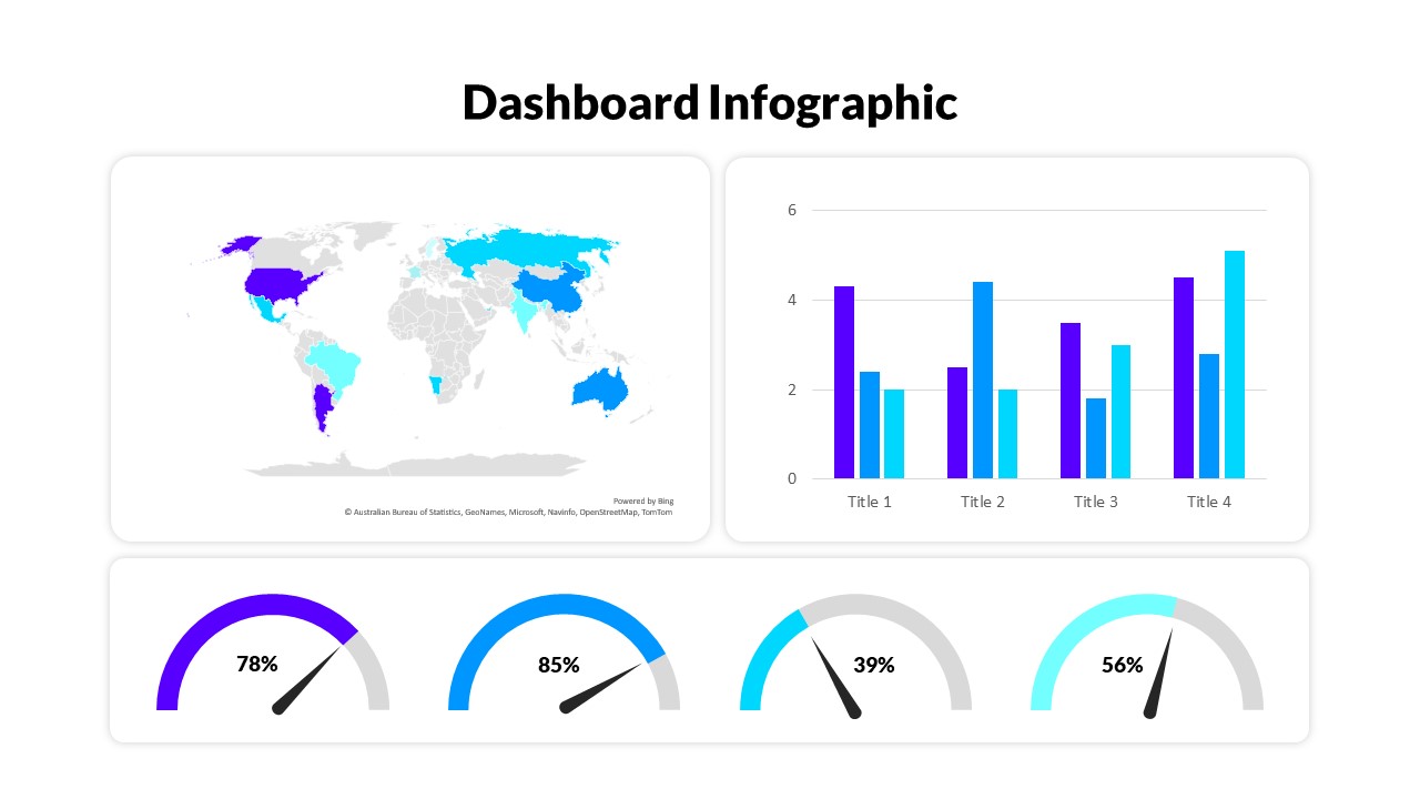
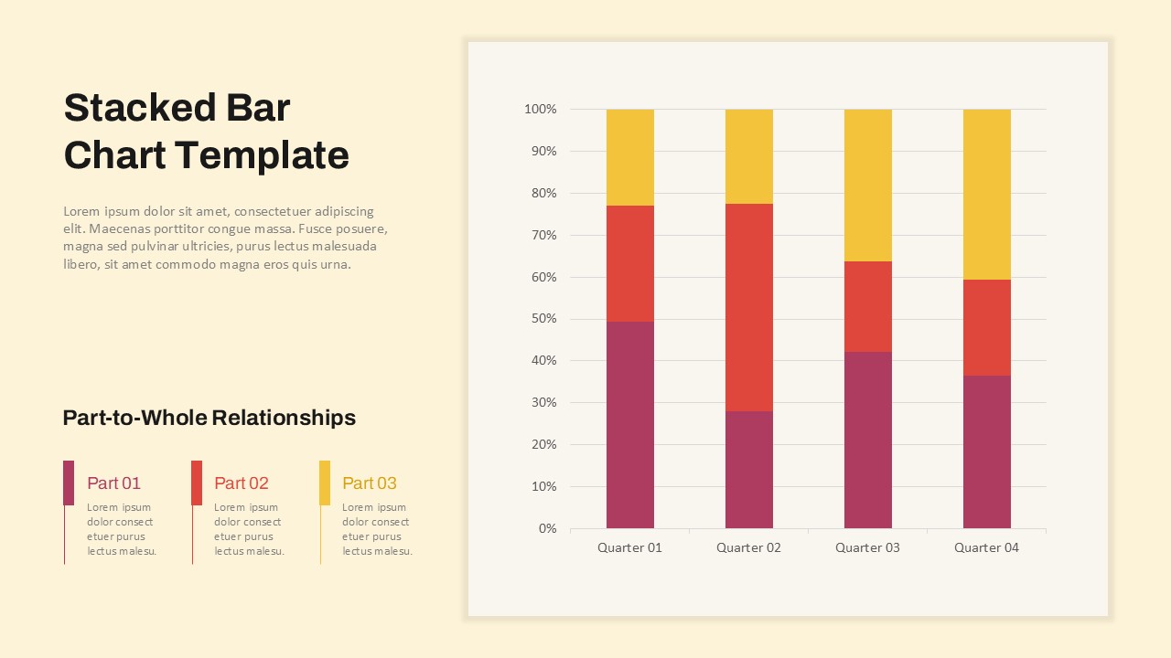
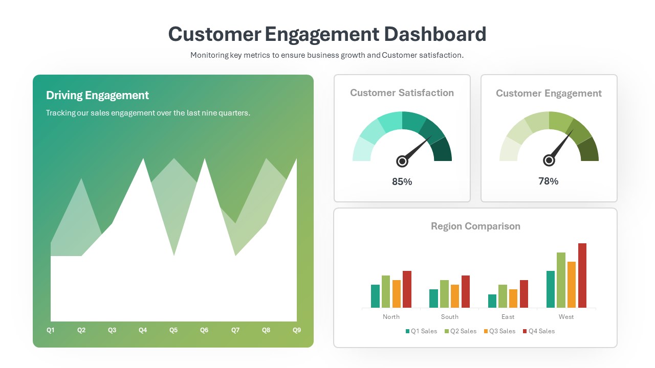
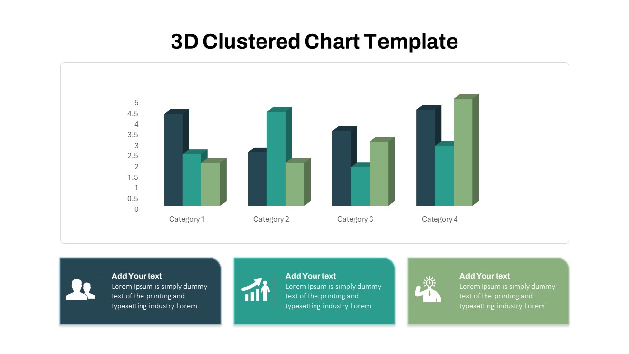
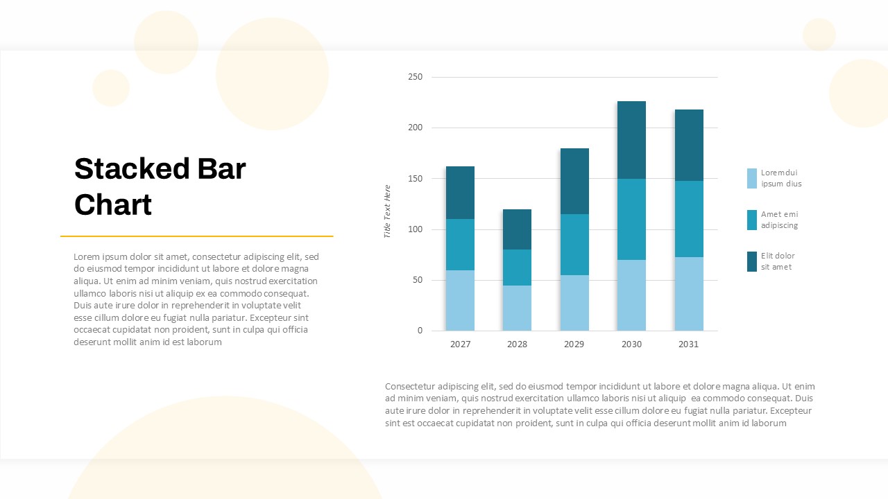
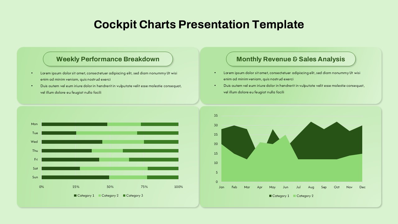
The slide layout features two primary sections: a Weekly Performance Breakdown and a Monthly Revenue & Sales Analysis. The left section incorporates a horizontal stacked bar chart that spans across days of the week, helping teams quickly identify patterns, gaps, and trends in daily activity or output across multiple categories. This is ideal for departments aiming to track team performance, task completion, or operational efficiency on a granular level.
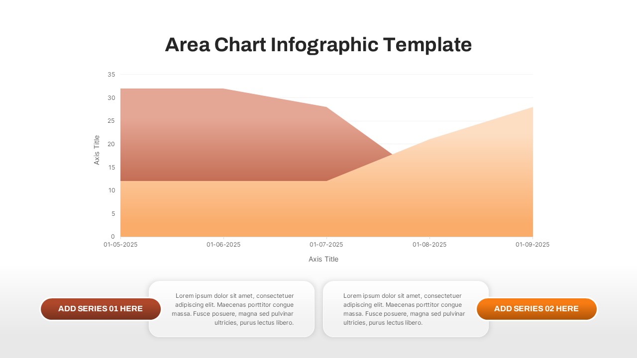
On the right, a dual-layered area chart presents a month-by-month sales and revenue progression across two categories. This visual helps stakeholders evaluate revenue streams, assess market fluctuations, and forecast trends, all at a glance. The use of subtle gradients and light green hues adds a calming yet professional aesthetic, making data not only easier to read but also visually appealing.
Fully compatible with PowerPoint and Google Slides, this template is 100% editable—allowing users to customize chart data, text, fonts, and colors to align with their brand identity or specific reporting requirements. Whether you’re in sales, operations, finance, or project management, this cockpit chart template serves as a dynamic hub for presenting data insights with clarity and confidence.
See more

Aspect Ratio
16:9Item ID
SKT03439
Features of this template
Other User Cases of the Template:
Business performance dashboards, sales review meetings, executive summaries, marketing performance tracking, project management reporting, operational efficiency reviews, KPI monitoring, team productivity analysis, investor update decks, departmental review presentationsFAQs
You May Also Like These Presentation Templates


- Free
- Free

- Free

- Free
- Free

- Free
- Free
- Free
- Free