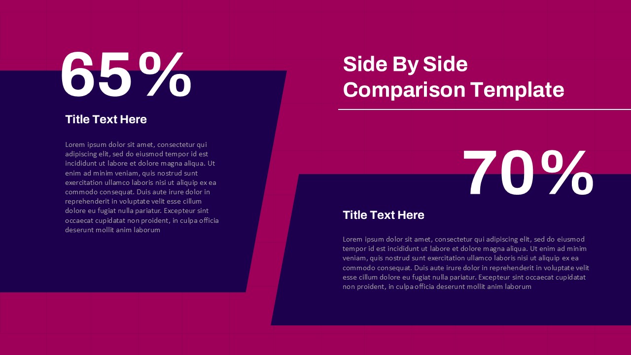
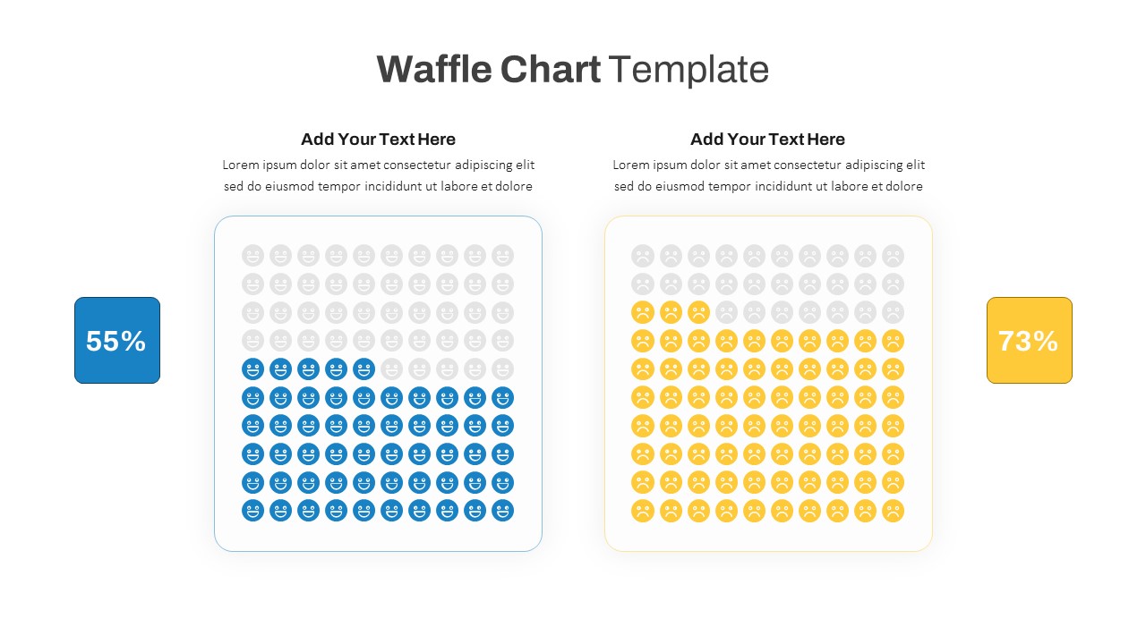
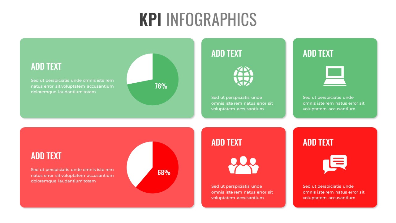
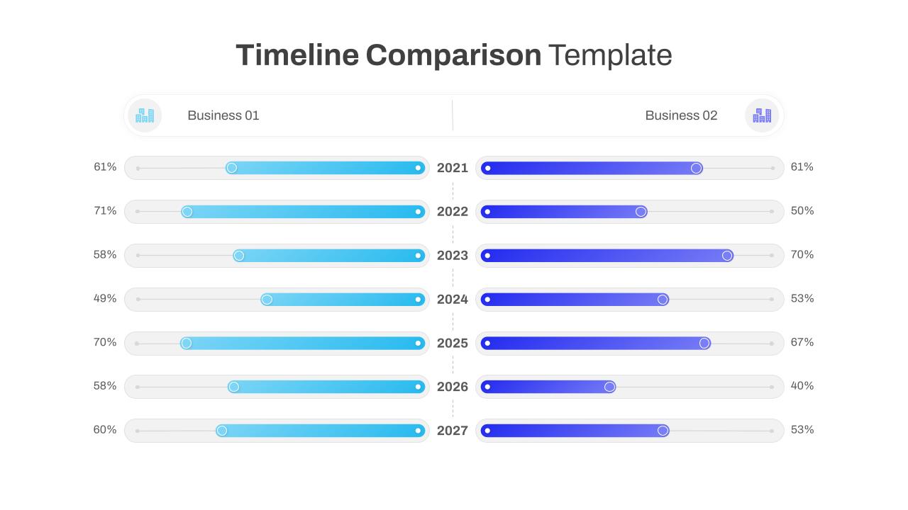
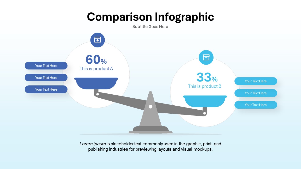
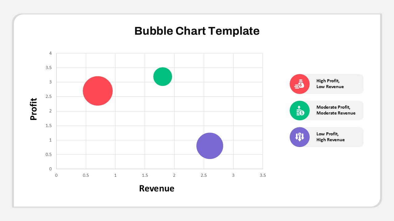
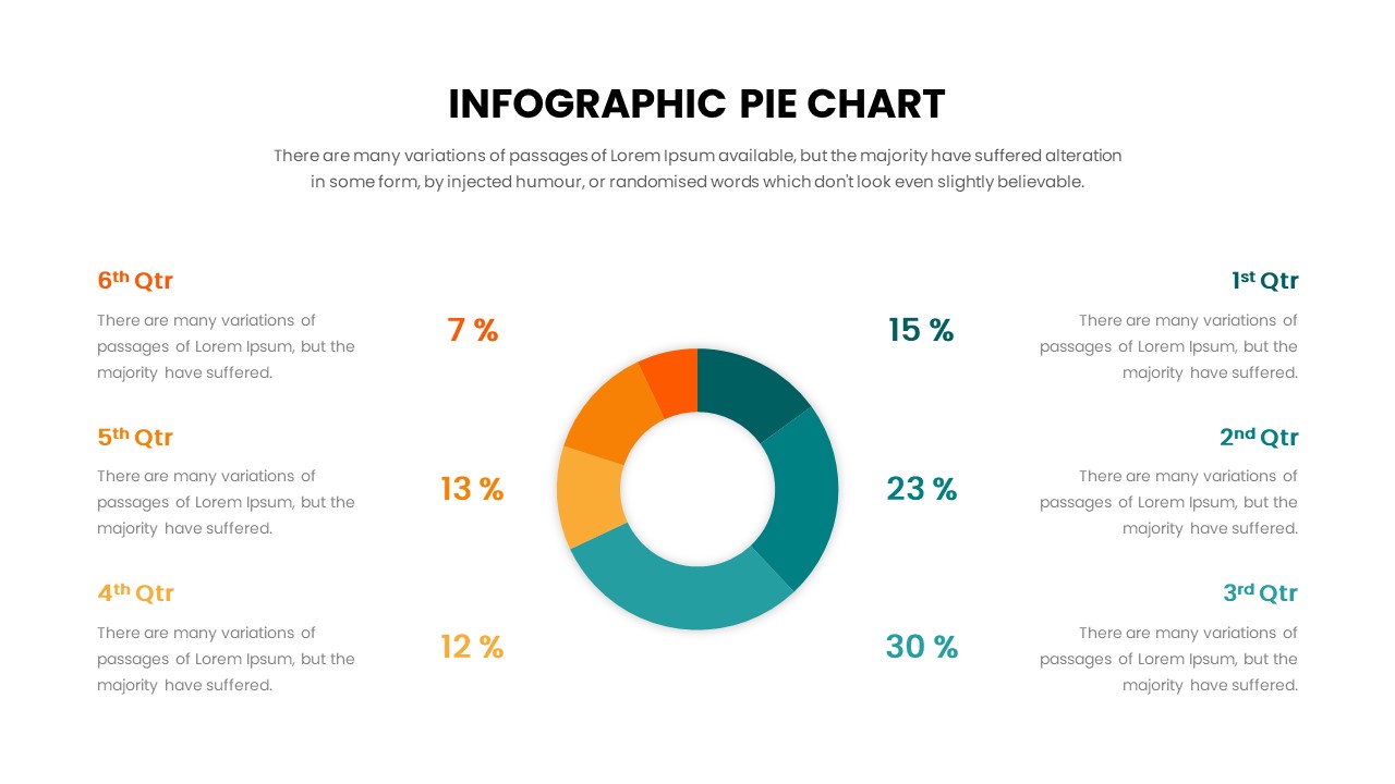
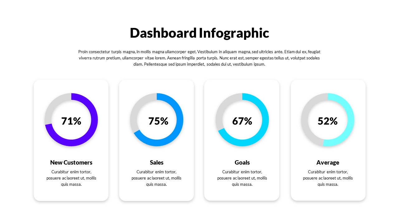
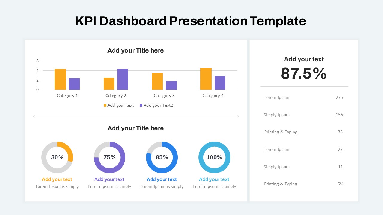
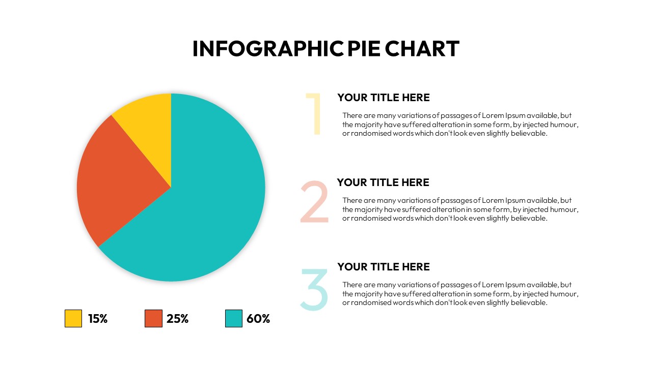
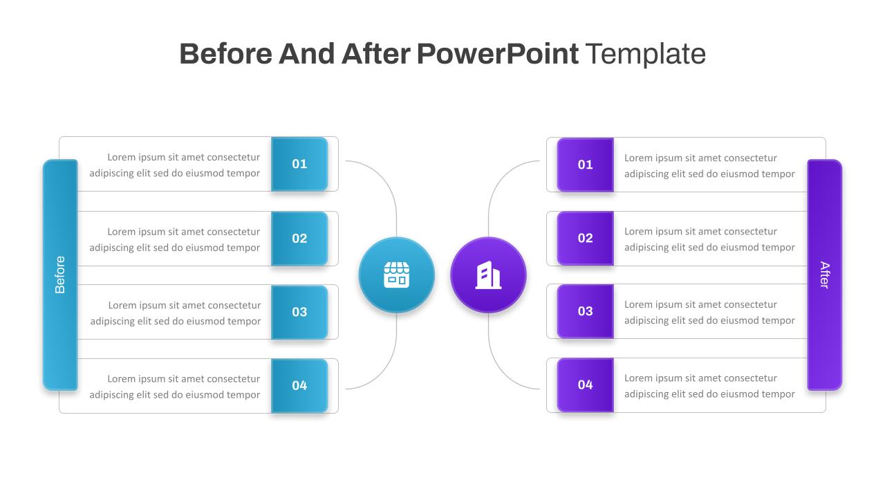
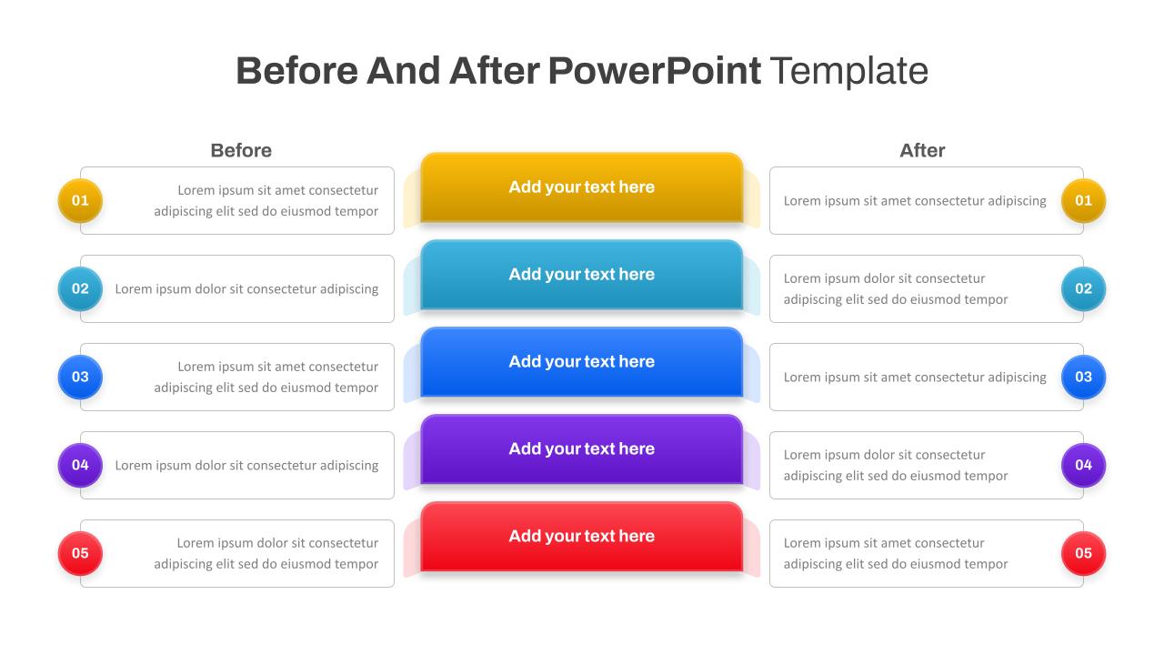
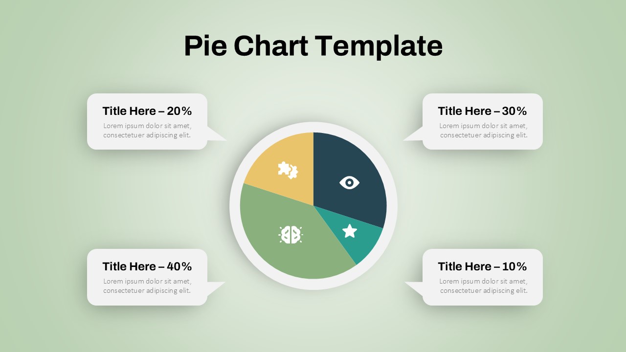
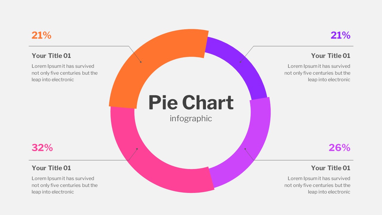
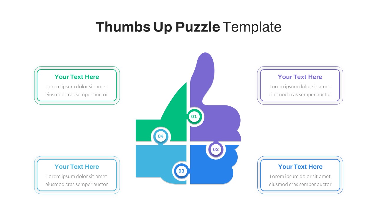
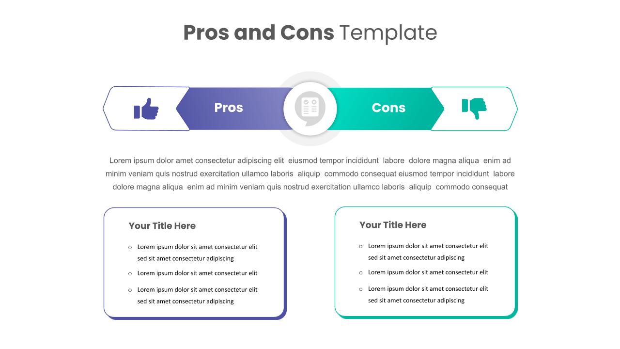
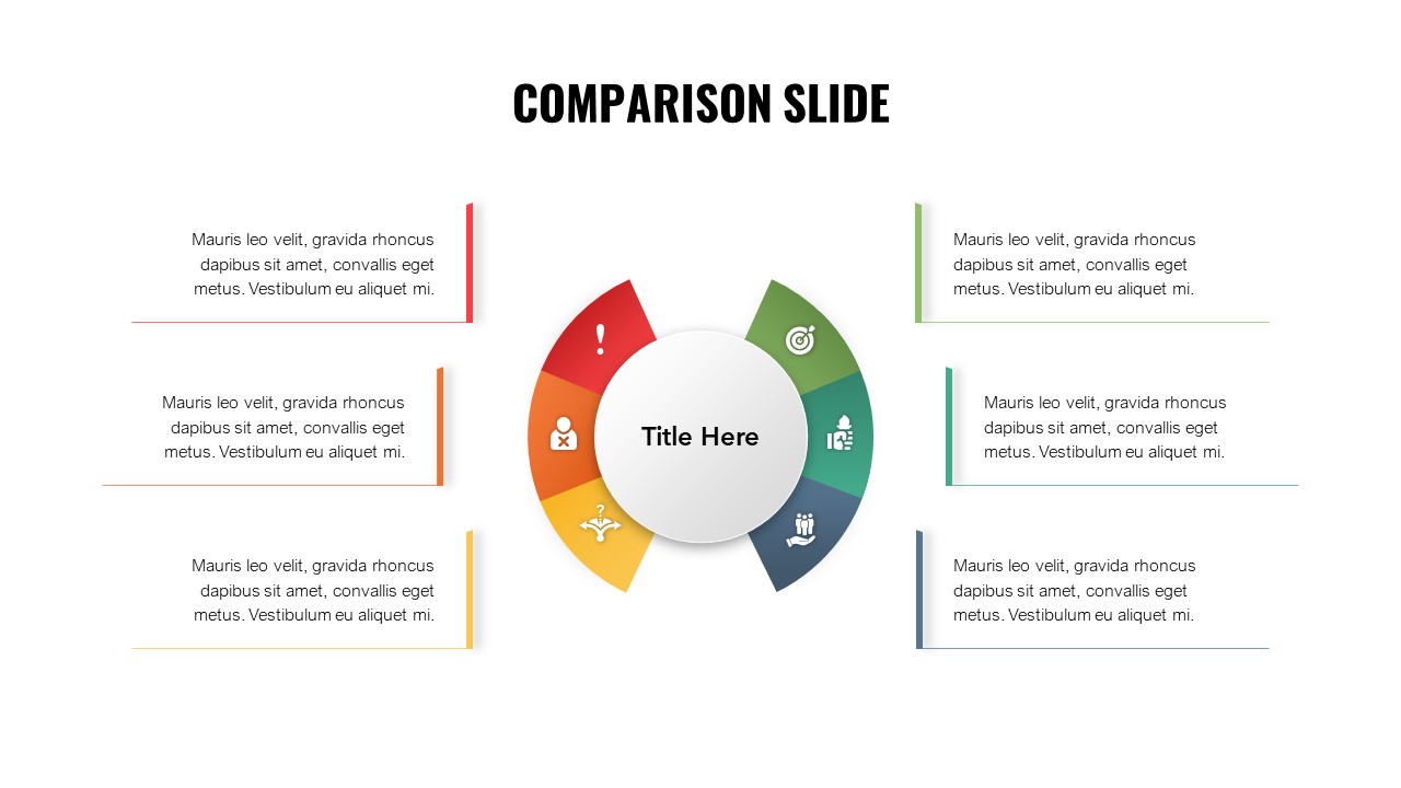
Donut Chart Comparison Template for Data Visualization
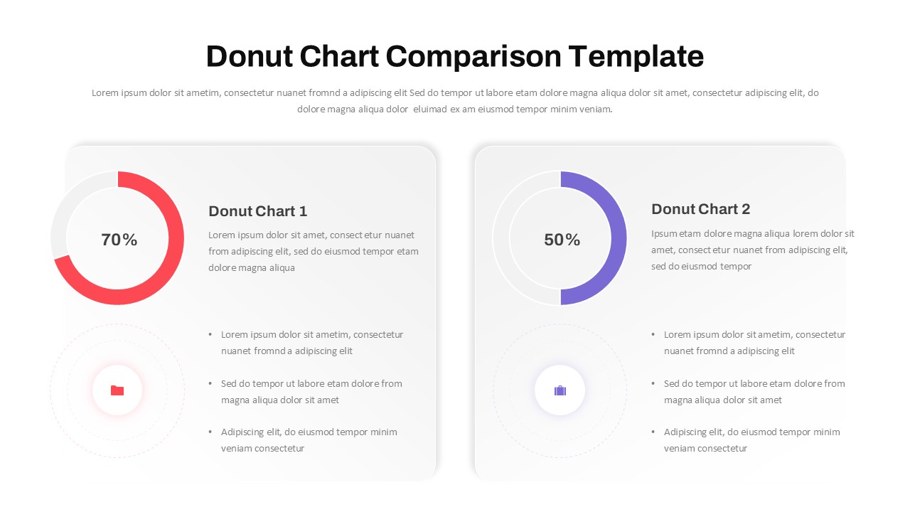
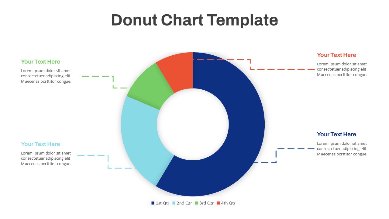
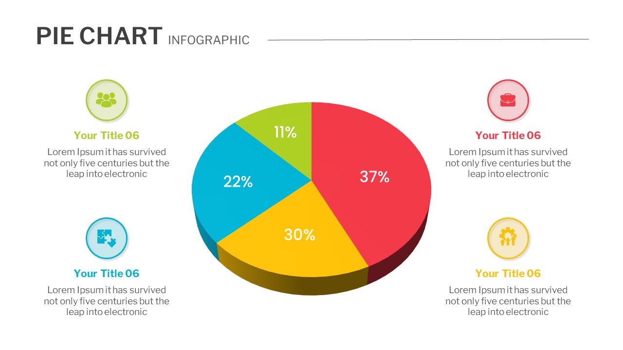
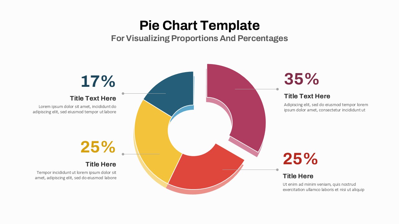
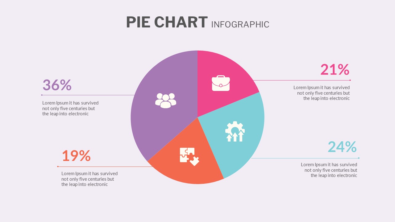
The Donut Comparison Chart In PowerPoint is an ideal visual aid for comparing two sets of data side by side. It offers a sleek and modern design, making it perfect for business presentations, financial reports, or any data-driven analysis. This comparison PPT slide template features two donut charts, each showcasing percentage values prominently in the center, making it easy for the audience to grasp key metrics at a glance. Each chart is paired with detailed text sections, allowing for further explanation of the figures displayed.
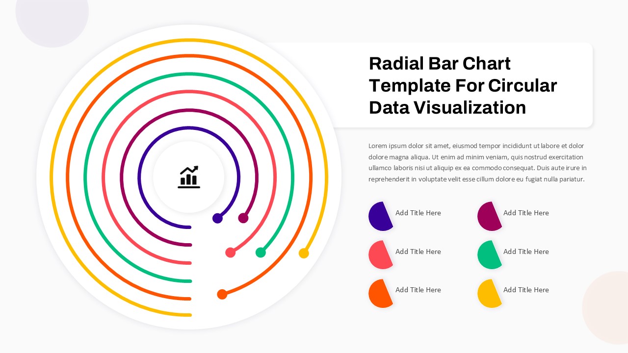
The simplicity of the donut chart design helps highlight the proportions of a whole, while the comparison setup enables you to juxtapose related data points, such as performance metrics, market share, sales comparisons, or customer satisfaction rates. This template ensures that complex information is presented in a digestible, visually appealing format, reducing information overload during presentations.
Completely customizable, this template allows you to adjust colors, text, and data values to fit your specific needs. Available for both PowerPoint and Google Slides, it ensures compatibility and flexibility for users on various platforms. Whether you’re presenting quarterly sales results, financial forecasts, or any form of performance metrics, this Donut Chart Comparison Template offers a professional and effective way to convey your data insights.
See more

Aspect Ratio
16:9Item ID
SKT01686
Features of this template
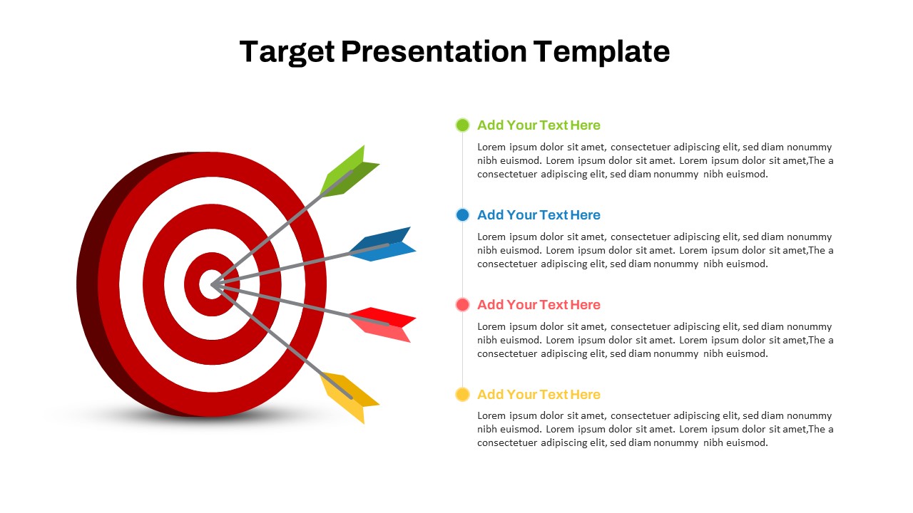
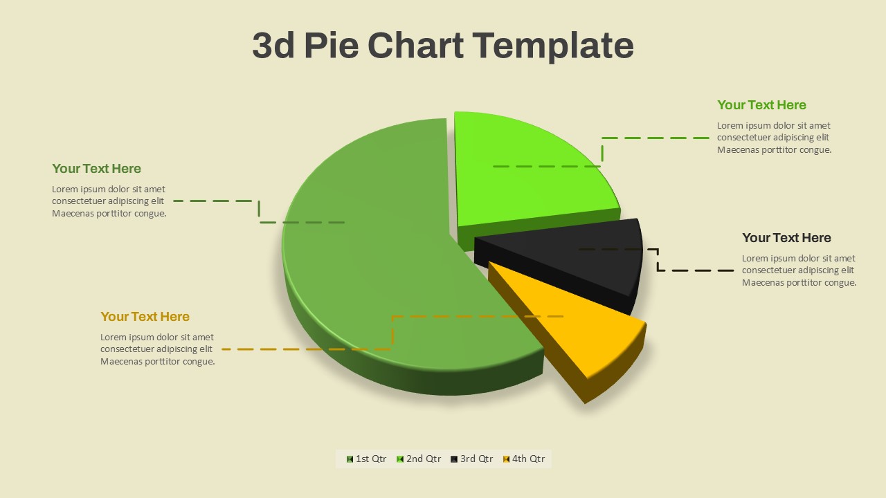
Other User Cases of the Template:
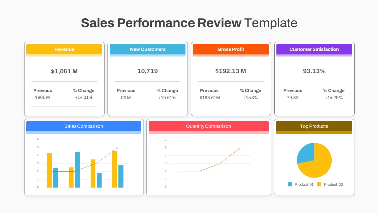
Sales performance comparison, financial report analysis, market share visualization, customer satisfaction survey results, product performance metrics, A/B testing results, business growth tracking, operational efficiency comparison, employee performance evaluation, budget allocation comparison.FAQs
You May Also Like These Presentation Templates


- Free
- Free

- Free
- Free

- Free
- Free
- Free
- Free
- Free

- Free