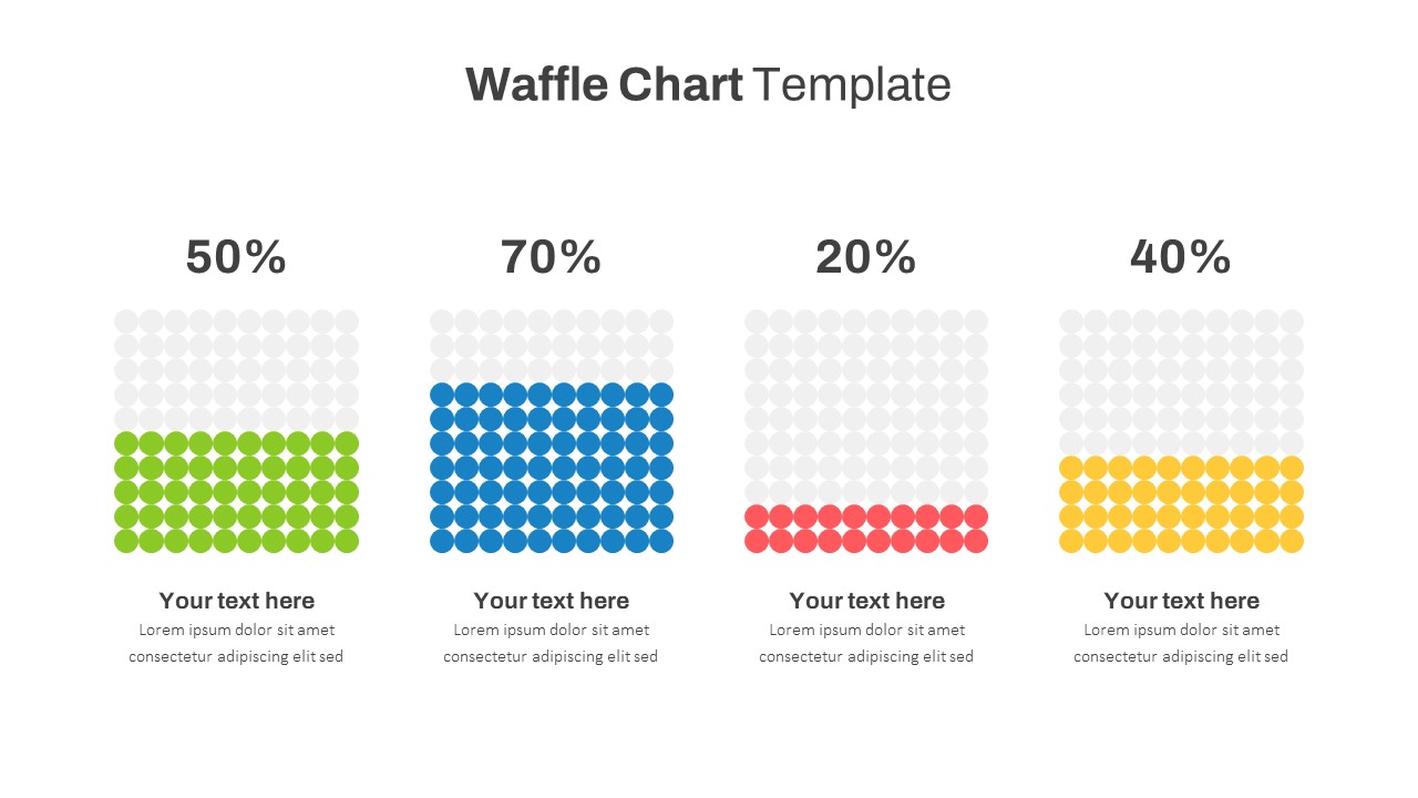
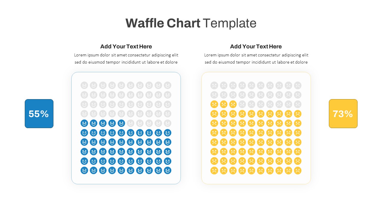
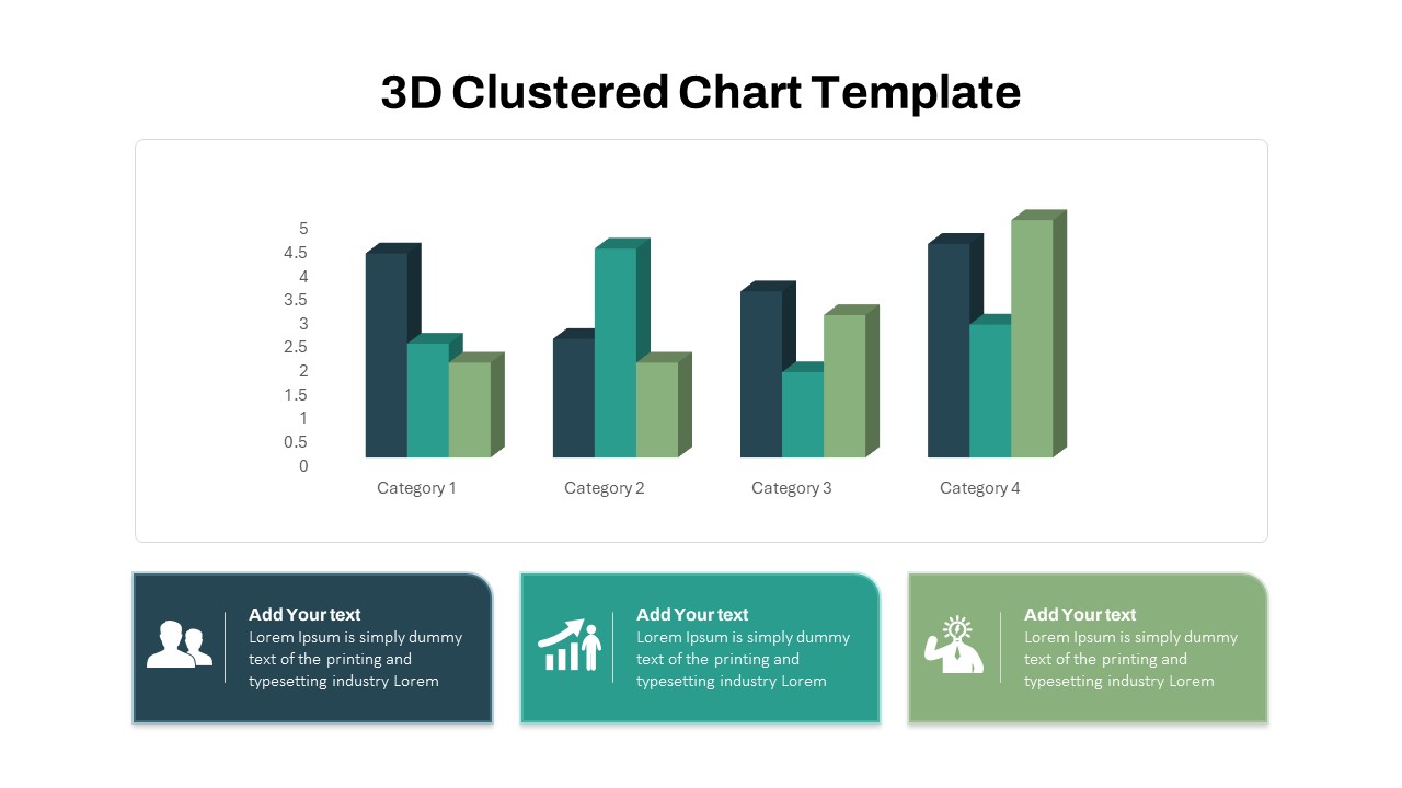
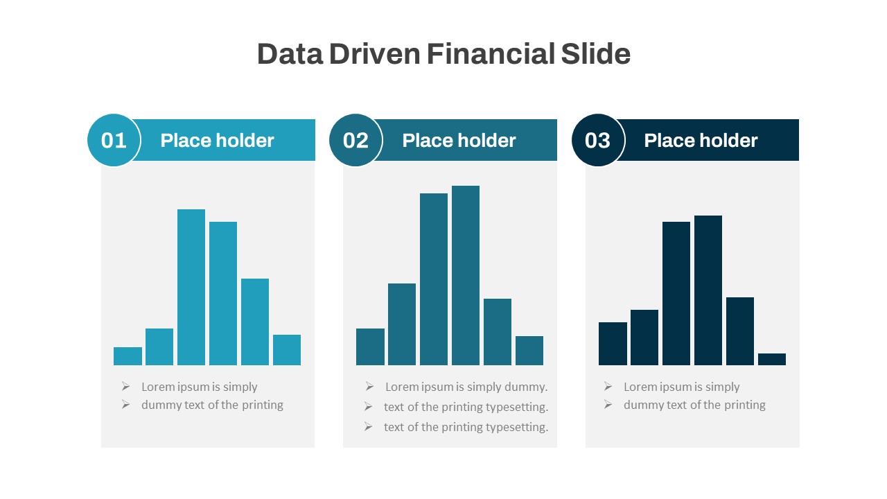
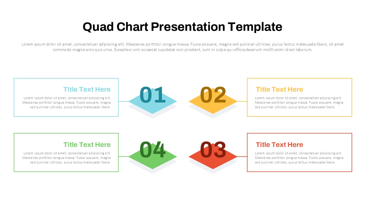
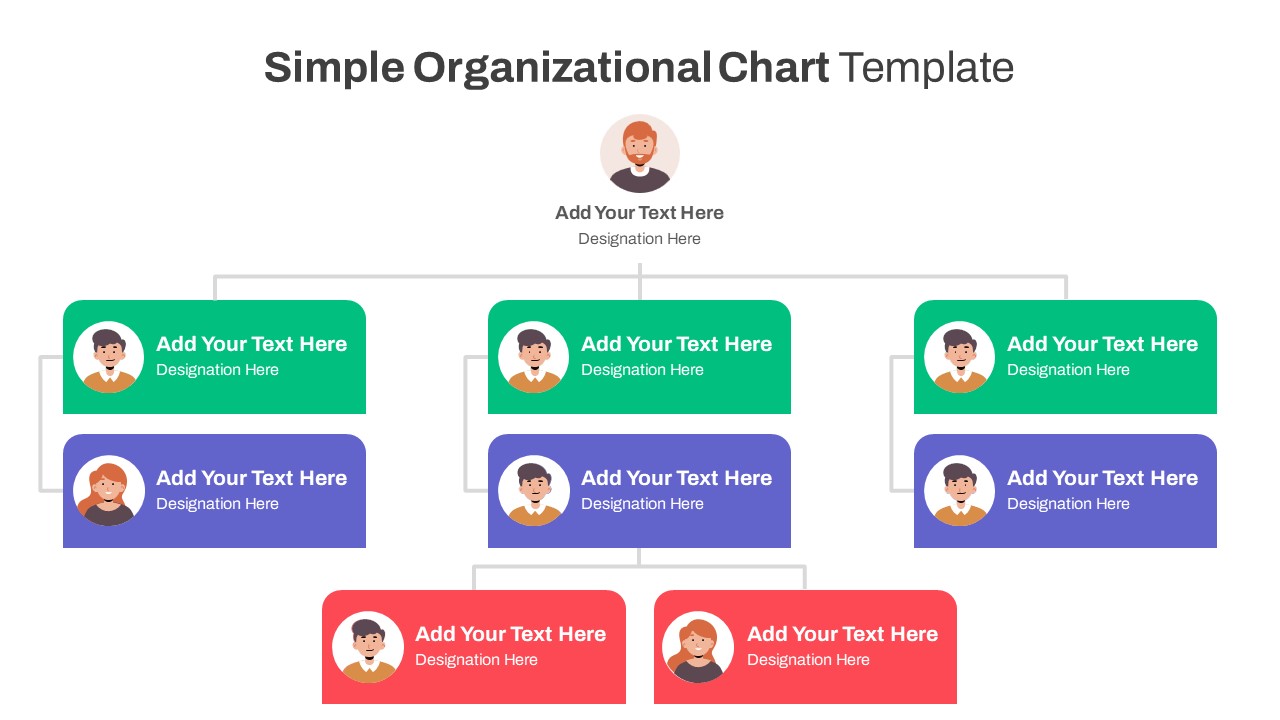
Engaging Waffle Chart Template
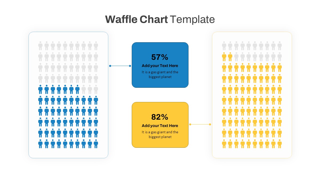
Visualize your data effectively with our engaging waffle chart for PPT, designed to make statistical information clear and accessible. This waffle charts template features two distinct waffle charts, each representing a different data set using colored human icons. With blue and yellow color schemes, the charts provide a vivid contrast that highlights the differences and relationships between the data points.
Each waffle chart is accompanied by a percentage figure in a bold, readable font, with space for additional explanatory text. This layout ensures that your audience can quickly grasp the key points of your presentation. The left chart, shaded in blue, and the right chart, shaded in yellow, are connected to central text boxes that allow for detailed descriptions or insights about the data.
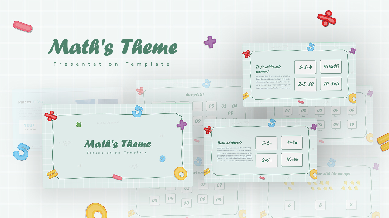
Perfect for a variety of professional settings, this template can be used in business presentations, educational contexts, and research reports. Whether you are presenting survey results, market analysis, or performance metrics, the waffle chart format is an excellent tool for breaking down complex information into an easily digestible visual format.
Fully editable in both PowerPoint and Google Slides, this template offers the flexibility to customize colors, text, and icon styles to match your brand or presentation needs. Enhance your data storytelling with a clean, modern design that ensures your information is presented in a compelling and professional manner.
See more

Aspect Ratio
16:9Item ID
SKT01170
Features of this template
Other User Cases of the Template:
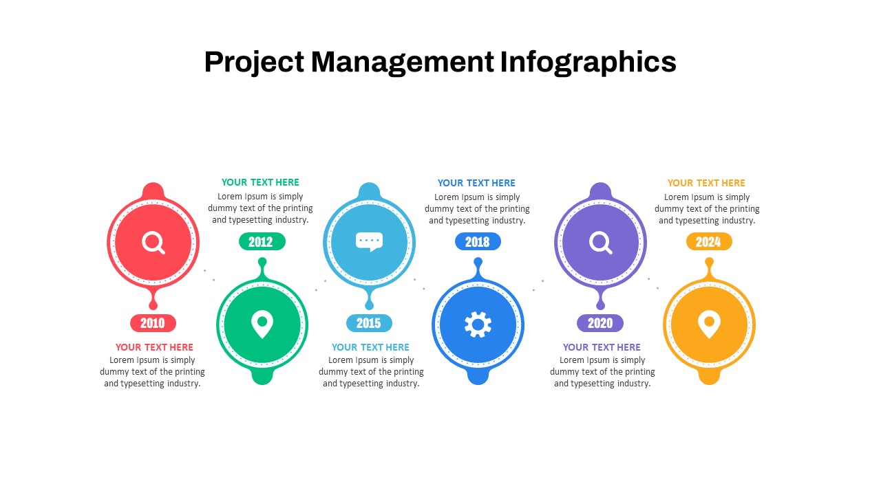
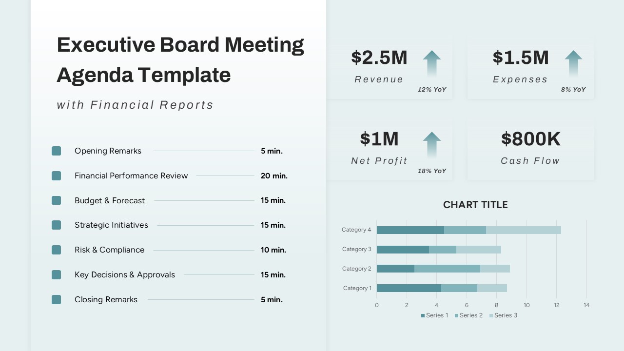
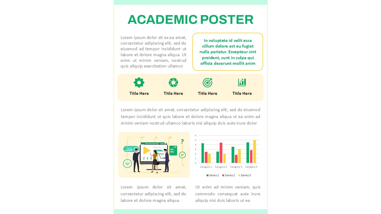
Survey results, market analysis, performance metrics, demographic studies, research data presentation, sales reports, academic research, comparative analysis, customer feedback reports, financial performance reviews, educational statistics, and business strategy sessions
FAQs
You May Also Like These Presentation Templates


- Free
- Free


- Free
- Free

- Free
- Free
- Free
- Free
- Free
- Free
- Free
- Free