Line Chart PowerPoint Template and Google Slides For Sales Performance Analysis Presentation

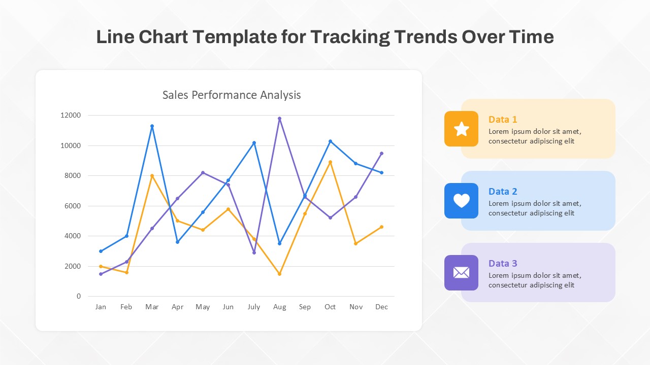
The Line Chart Template for Tracking Trends Over Time provides a clear and effective way to visualize performance data across months or other periods. Featuring a multi-line graph setup, this Line Chart PowerPoint Template allows users to track up to three distinct datasets, making it perfect for comparing metrics such as sales, revenue growth, or other key performance indicators over a year. The chart's structure is ideal for spotting trends, identifying peak performance months, and analyzing dips or fluctuations in data. Each line in the graph is color-coded, ensuring data points are easy to distinguish at a glance.
Accompanying the main chart are three colorful icons with descriptive text boxes, each aligned with one of the data lines. These labels provide a quick summary or additional context for each dataset, allowing presenters to effectively communicate the significance of each data set to their audience. This combination of line chart and descriptive labels makes this template versatile, engaging, and easy to adapt for a variety of professional settings, from quarterly sales reports to financial forecasting.
Available for both PowerPoint and Google Slides, this template is fully customizable. Users can adjust colors, modify data points, and reformat the layout to fit their specific branding or presentation style. Whether you are a marketer, sales analyst, business manager, or financial advisor, this template provides an accessible tool for presenting data in a visually compelling format that keeps your audience engaged and informed.
See more


