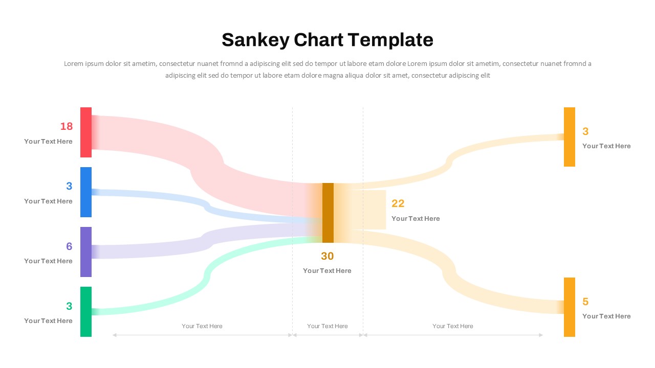
Sankey Chart PowerPoint Template and Google Slides

The Sankey Chart PowerPoint Template is an exceptional tool for visualizing complex data flows, relationships, and proportions. Designed with a sleek and modern layout, this template allows you to showcase inputs, outputs, and dependencies clearly and effectively. Its vibrant color-coded flows and well-defined labels make it ideal for presenting energy flows, financial distributions, supply chain processes, or customer journey mapping.
Perfect for professionals, educators, and analysts, this template enables you to highlight key data insights and communicate your message with clarity. The editable features in PowerPoint allow for customization of text, colors, and layout to suit your specific data and branding requirements.
Disclaimer: This template is fully editable in PowerPoint, but it has limitations when used in Google Slides due to the intricate design of the flow elements. Users are advised to make edits in PowerPoint for optimal customization before importing to Google Slides.
See more


