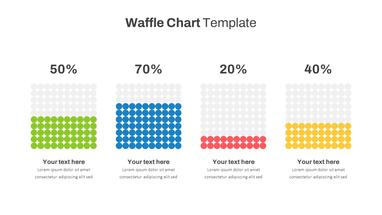
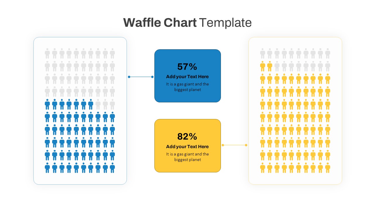
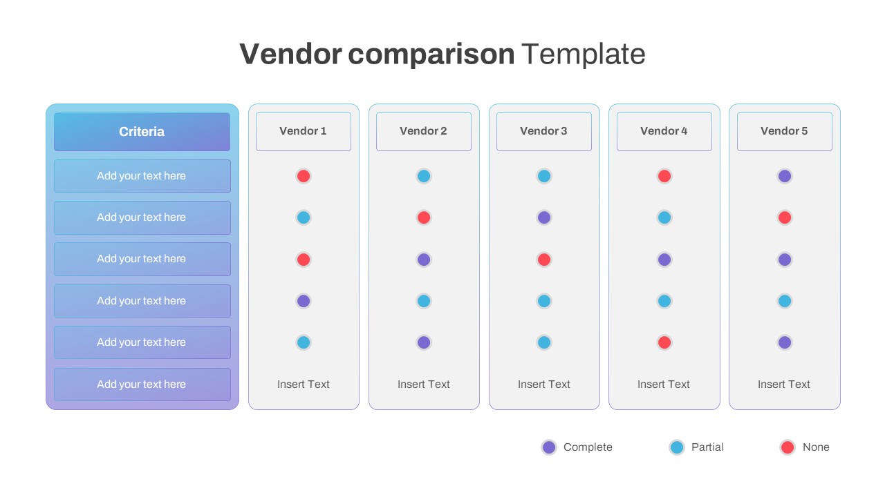
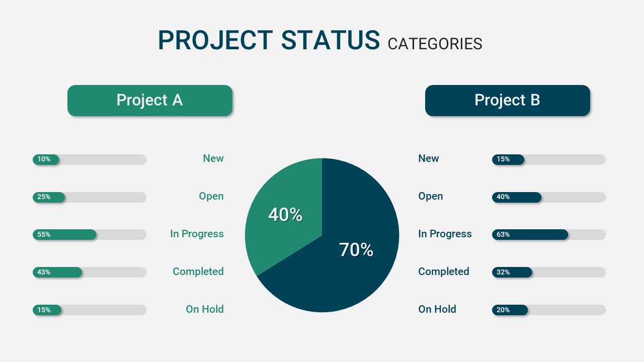
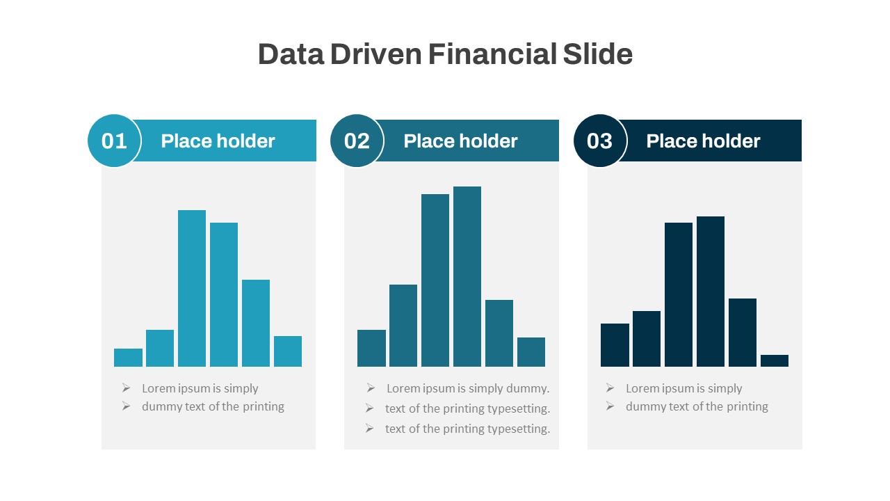
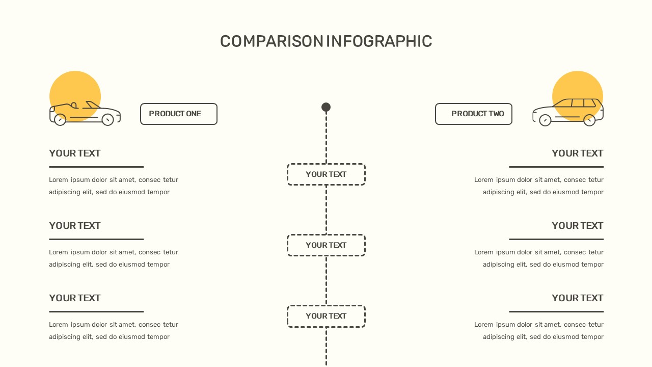
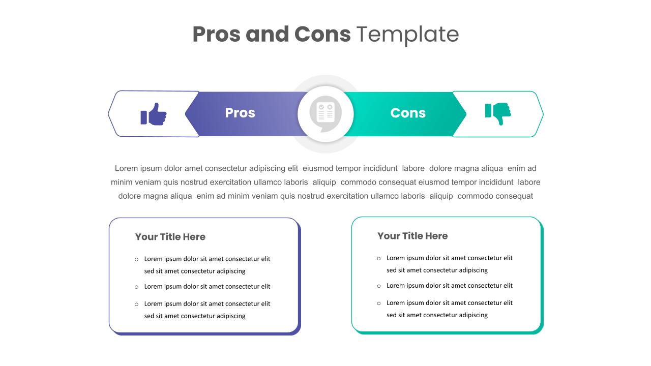
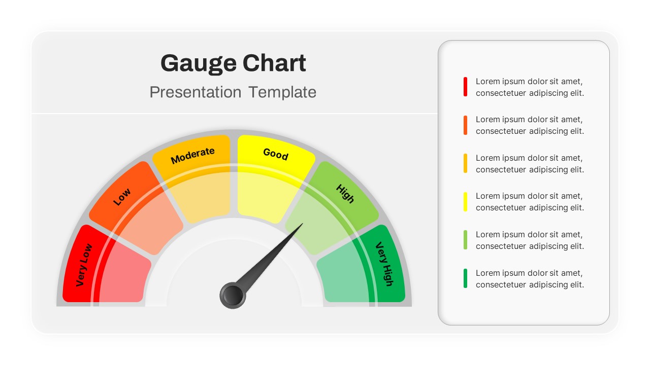
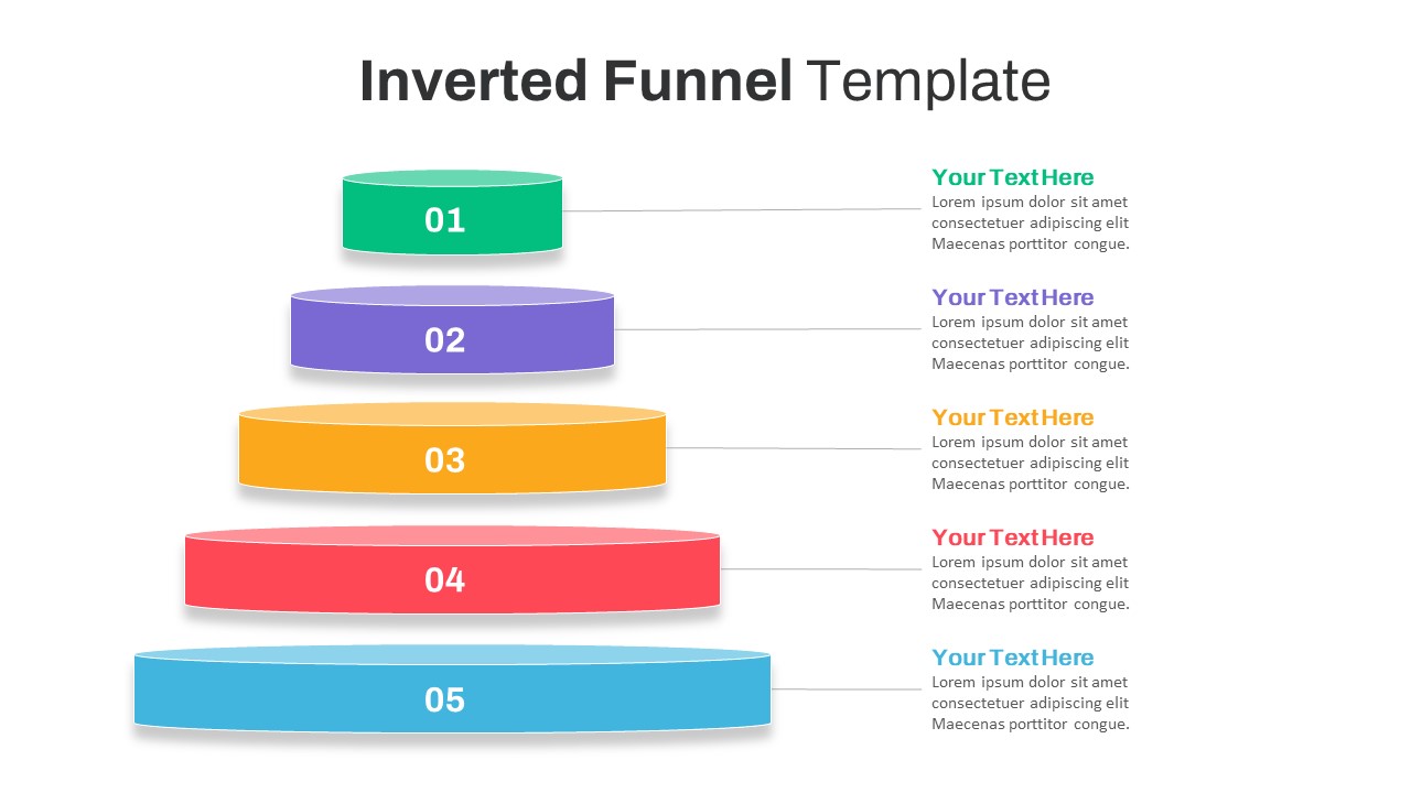
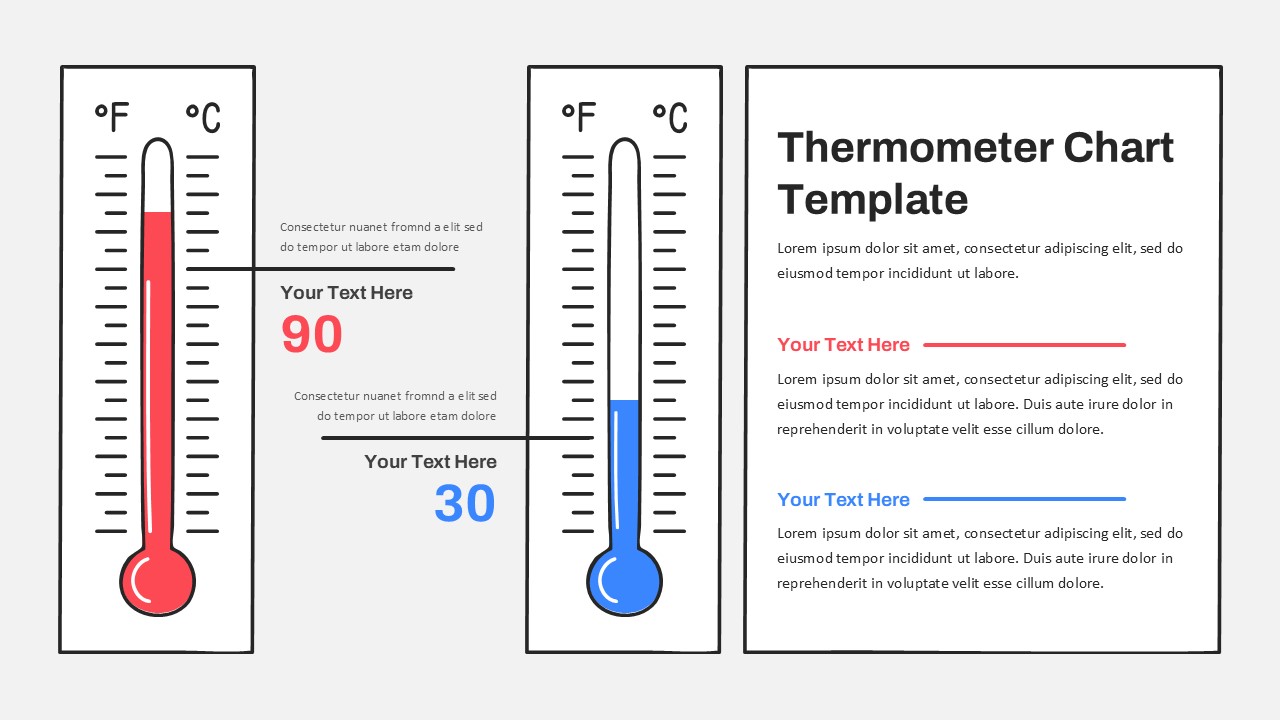
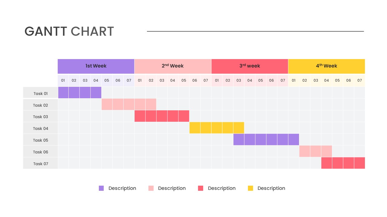
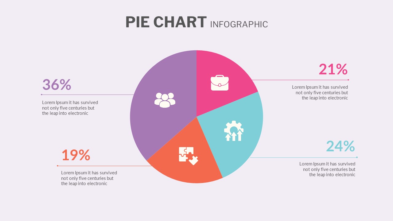
Waffle Charts Comparison Presentation Template
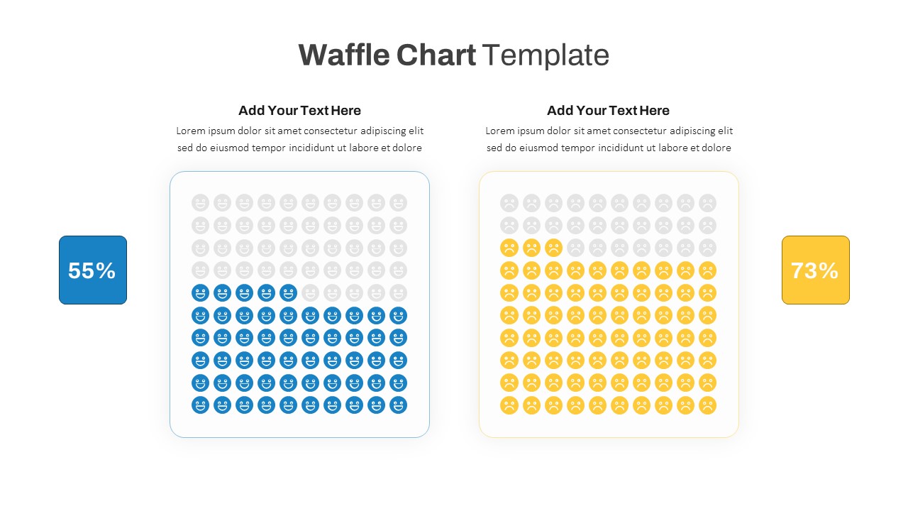
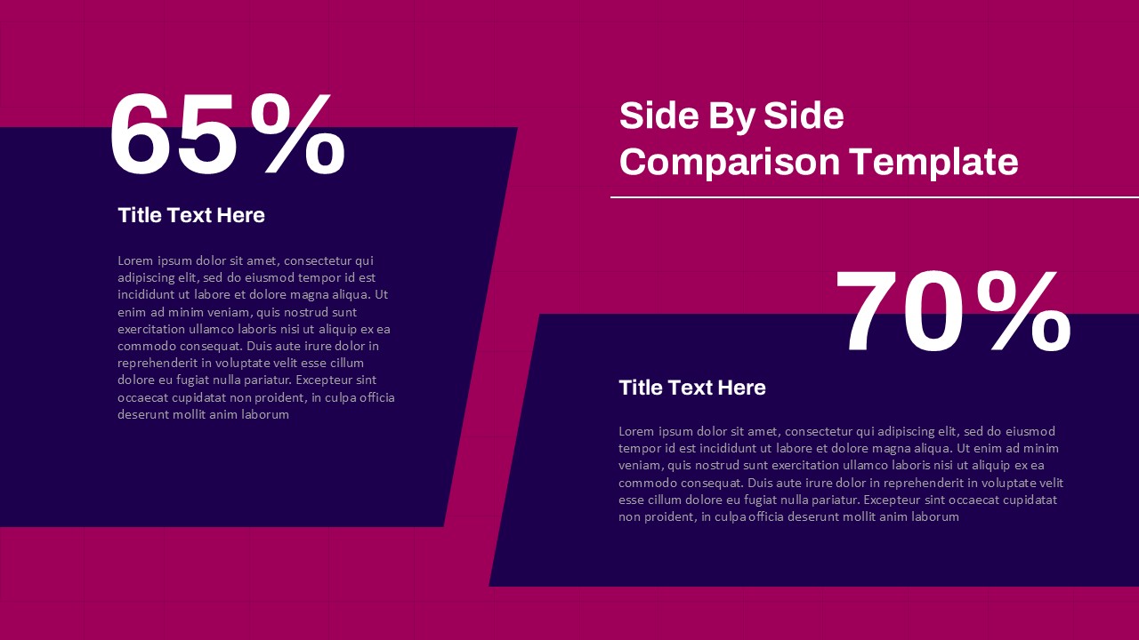
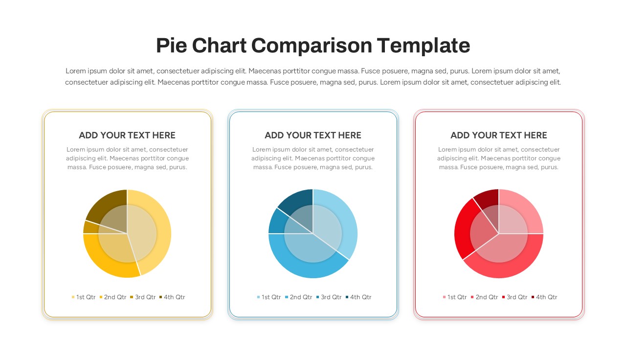
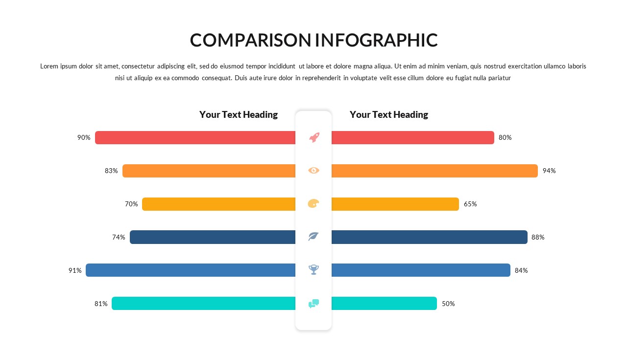
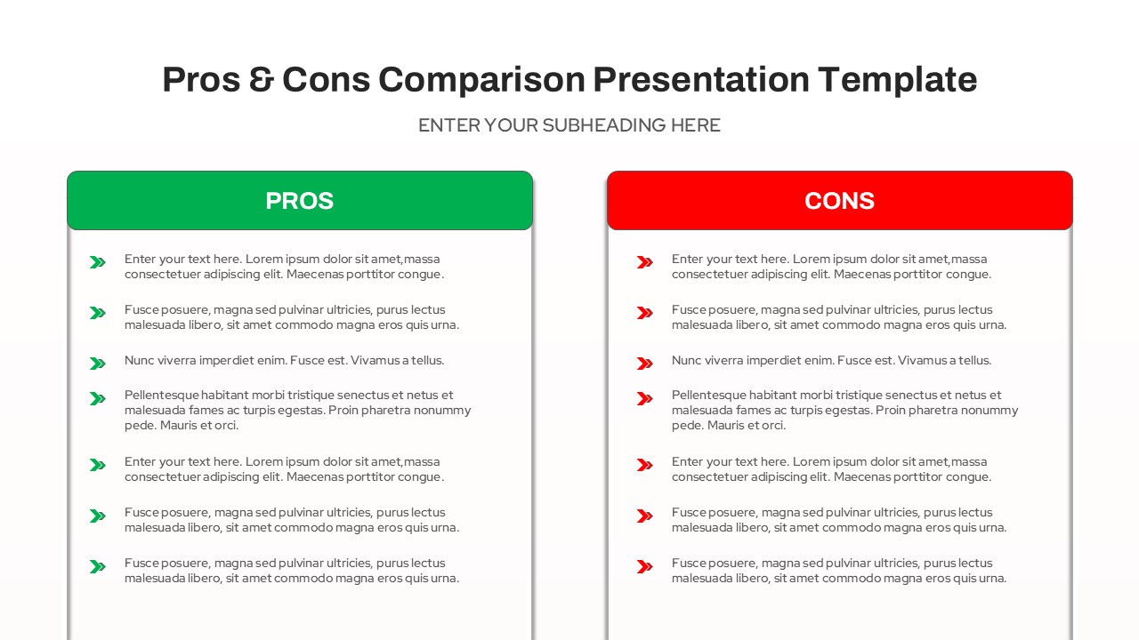
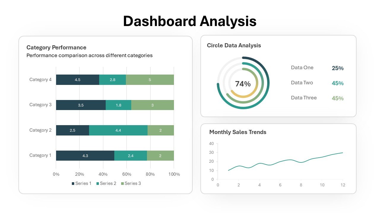
The Waffle Chart Comparison PowerPoint Presentation Template is a dynamic and visually appealing tool designed to present proportional data in a clear and engaging format. This waffle charts presentation template features two side-by-side waffle charts, each representing a different data set with a grid of small icons. The grid layout is perfect for showing percentages or other fractional data in a manner that’s easy for audiences to grasp at a glance. Each waffle chart is paired with customizable text boxes above and a percentage indicator to the side, allowing you to provide context and highlight key statistics effectively.
Ideal for business presentations, academic research, or any scenario where a visual representation of data comparison is needed, this template enhances your ability to communicate data-driven insights clearly. Whether you’re comparing survey results, financial metrics, or customer satisfaction scores, the color-coded design ensures that each data set is distinct, making your presentation not only informative but also visually engaging.
The template is fully customizable and compatible with PowerPoint and Google Slides, offering flexibility to adjust colors, icons, and text to match your branding or presentation theme. Its clean design ensures that your data remains the focal point, making it an essential tool for professionals looking to make impactful data comparisons.
See more

Aspect Ratio
16:9Item ID
SKT01168
Features of this template
Other User Cases of the Template:
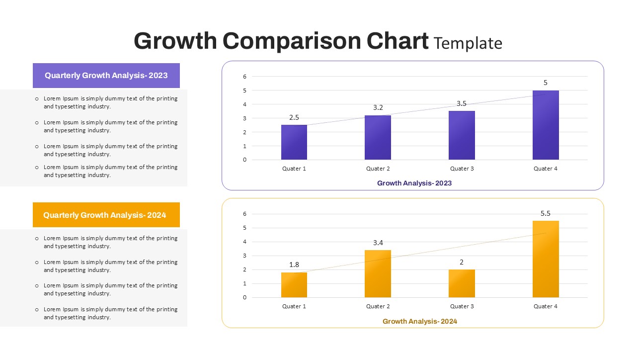
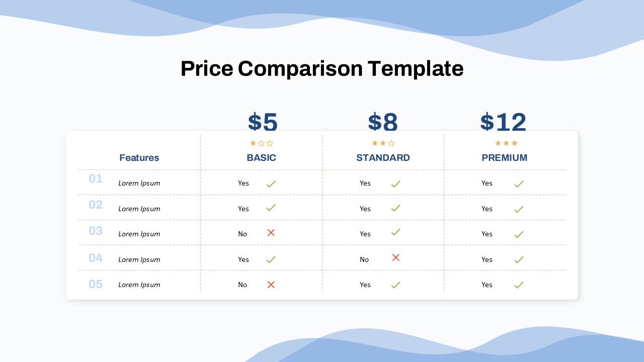
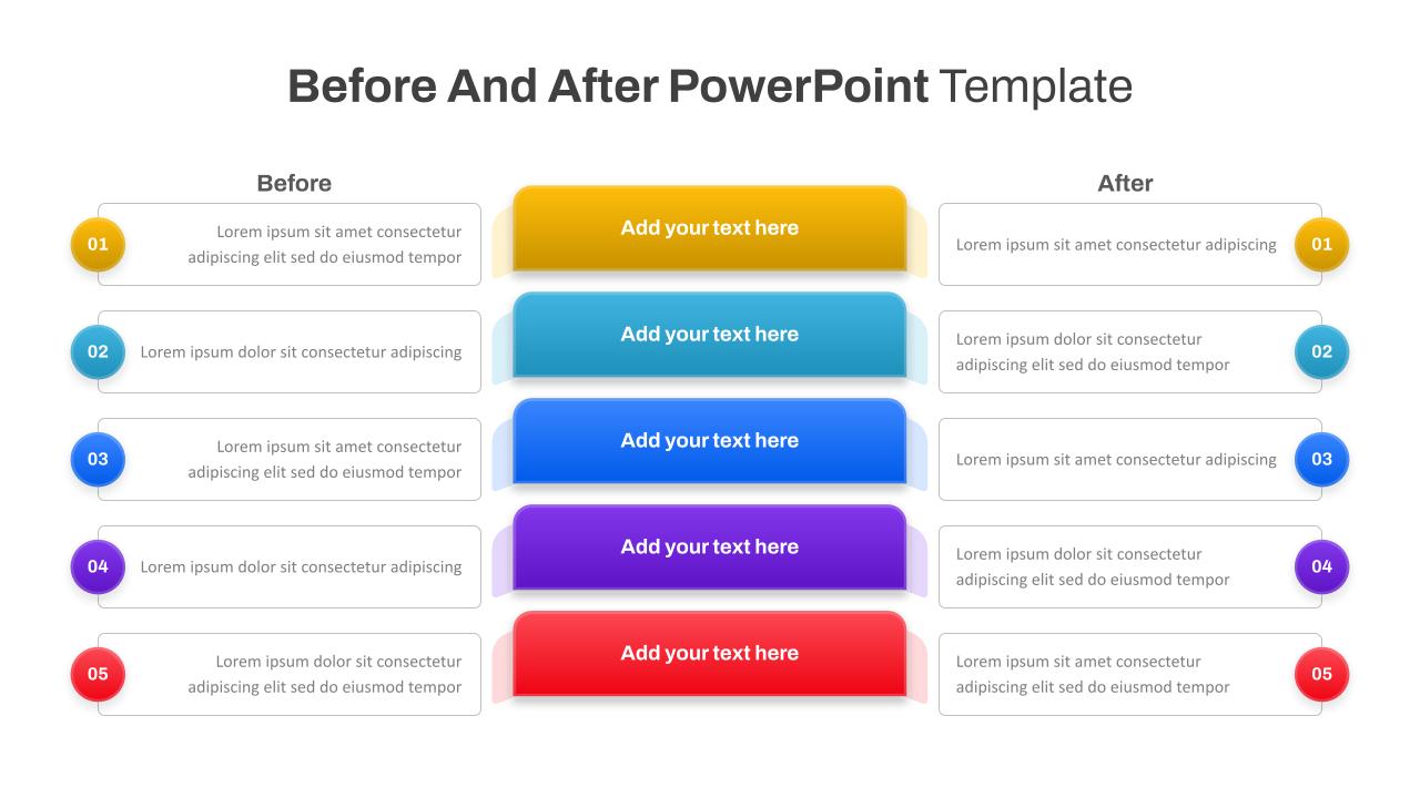
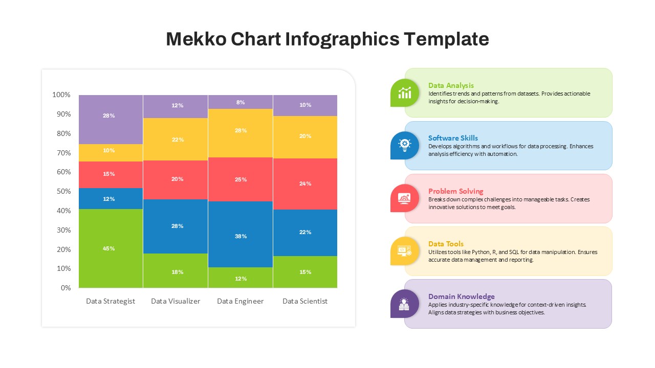
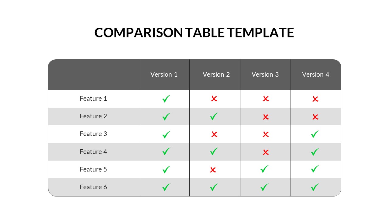
Customer satisfaction surveys, financial performance comparisons, market research presentations, product feature analyses, employee engagement reports, academic research findings, public opinion polls, marketing campaign results, sales data comparisons, operational efficiency reports.
FAQs
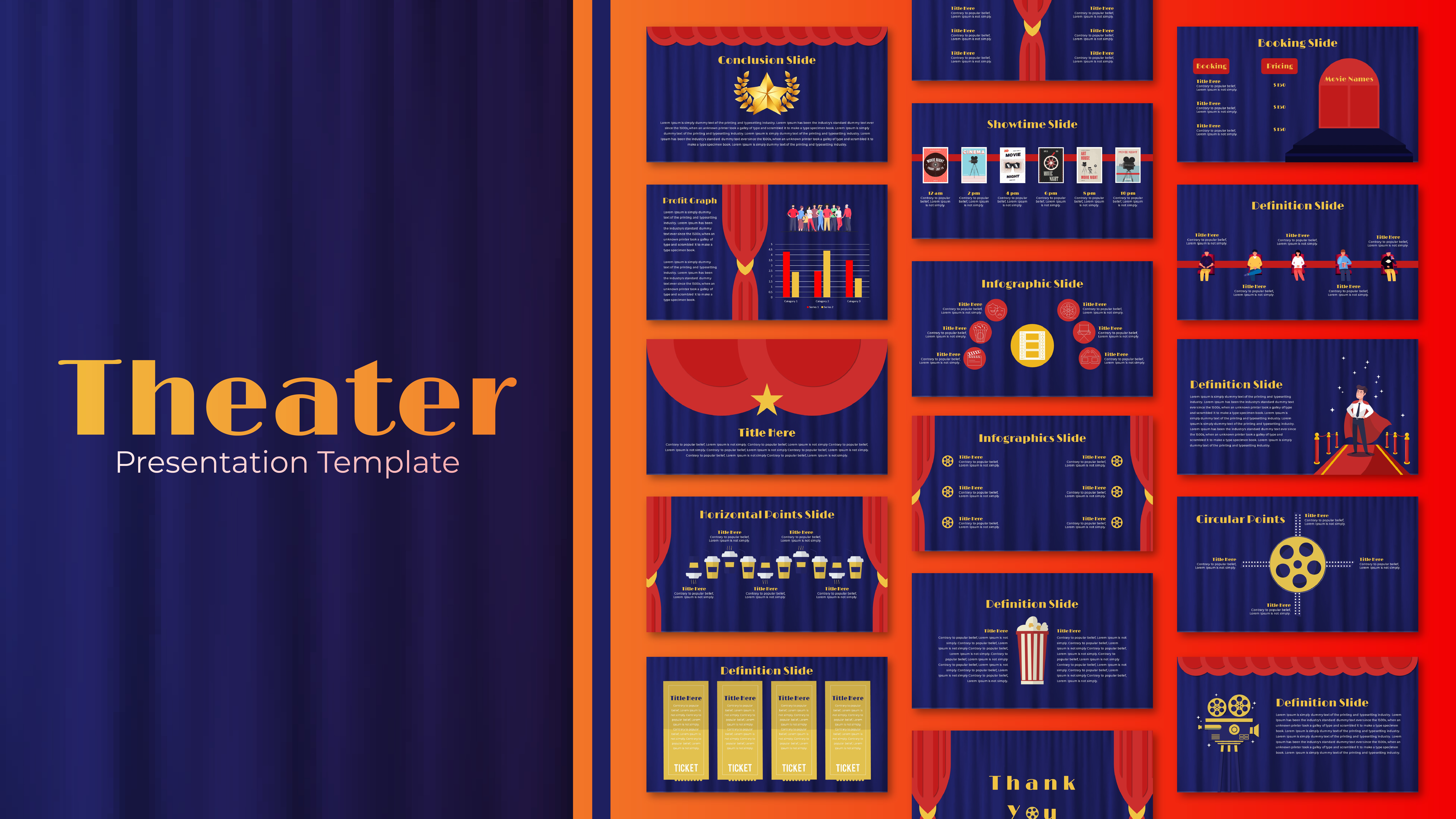
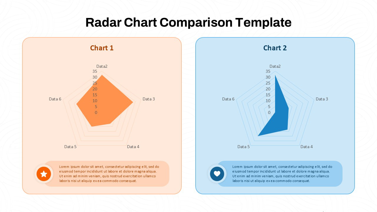
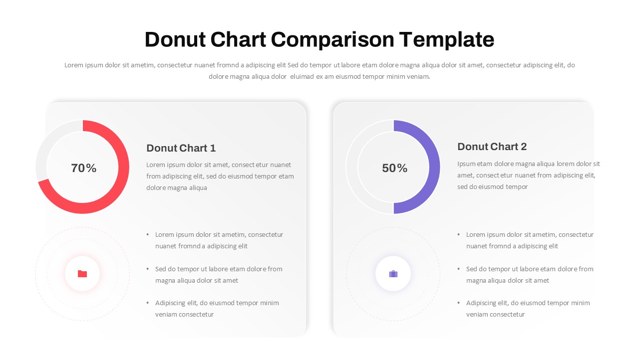
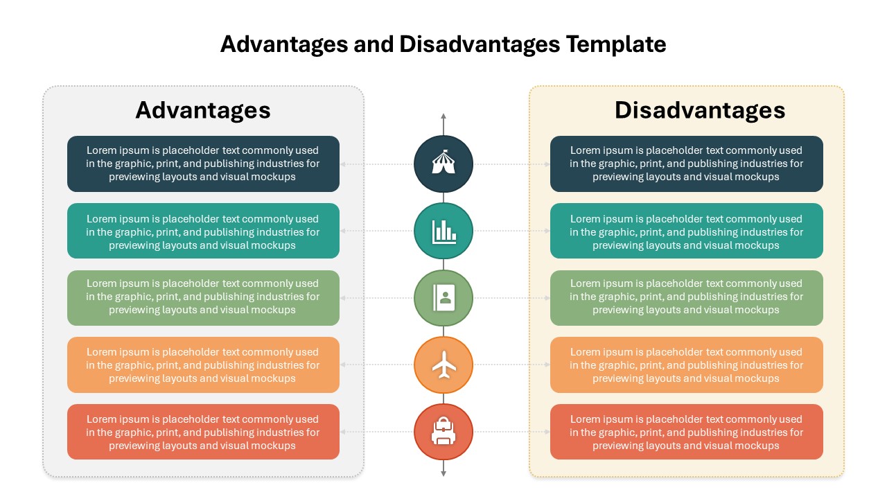
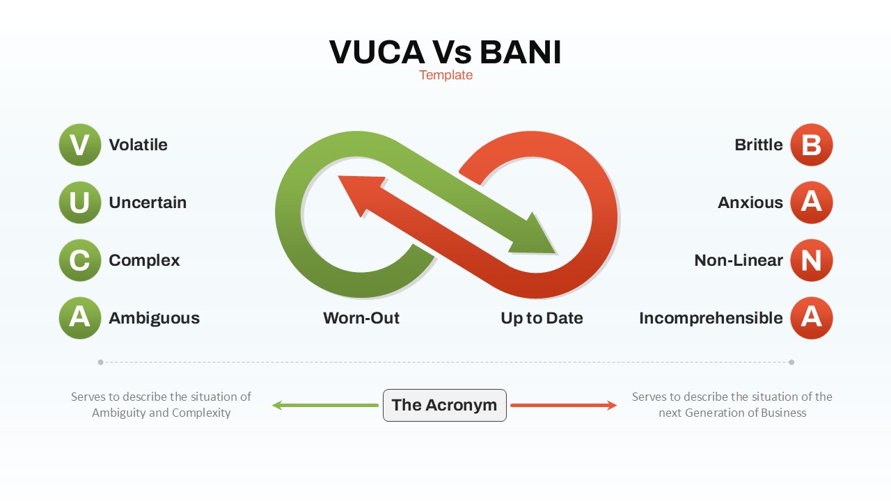
You May Also Like These Presentation Templates


- Free
- Free


- Free
- Free

- Free
- Free
- Free
- Free

- Free